- Home
- Fundamentals of Email Marketing
- What Is a Call to Action in Em ...

The email marketing jargon uses a lot of abbreviations, among which CTA stands out as one of the cornerstones of your marketing effort.
The call to action in email marketing is the springboard to much-desired further actions from your prospective customer. After all, the goal of a marketing email is to generate a transaction or a different meaningful action by making the reader move on to “Buy Now,” “Learn More,” or “Sign Up.” It is action versus inaction, moving on versus holding back. It is the coveted switch that, when flipped, leads to a return on your investment.
When your readers press the CTA button, whether “Buy Now,” “Learn More,” or “Sign Up,” they get closer to the desired outcome of your marketing campaign, whether it is making a purchase, reading a blog post, joining a newsletter, etc.
To illustrate how important CTAs are to an email marketing campaign, a study by Wordstream suggests that emails with just one CTA can increase clicks by over 371% and sales by nearly 1,617%. So, stay with us to learn more and ensure you do not miss your chance in your next marketing push.
Types of CTAs in Email Marketing
There exist three types of CTAs: primary, secondary, and contextual CTAs. Each type has its purpose.
Primary CTA
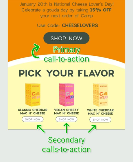
There is a distinct difference between a primary and secondary CTA. The primary CTA unequivocally prompts the email recipient to implement the action you want them to complete. The primary CTA is about the sale, be it in the form of a purchase, calling for an estimate of work to be done, scheduling an appointment, the list goes on. These CTAs are the most important from the business point of view as they generate revenue. Below is a great example of powerful, impactful, and hard-to-miss strategically placed primary CTAs.

Secondary CTA
The less visible CTAs, the ones that do not encourage the customer to perform an immediate direct action but rather offer an alternative action, are called the secondary CTAs. These are less visible and more subtle. The picture below clearly illustrates the difference.
Secondary CTAs should be styled in a less dominant way than primary CTAs. This prevents them from competing with one another. You can do that by using a more muted style for your secondary CTA.
Contextual CTA
Contextual CTAs are placed as an organic part of the content that the user is reading at the moment. We are talking about a much subtler approach than the primary CTAs, as it is about gently guiding the user along the journey rather than encouraging an action with a direct prompt. Contextual CTAs need to be placed with due account for the current stage in the user’s journey.
There may be little daylight between contextual and in-line CTAs, but there is still a subtle difference. Fitted seamlessly in the middle of your message, inline CTAs are usually a hyperlinked text leading to a landing page or a piece of relevant content.
Best Practices for Effective CTAs
- Clarity and conciseness
Making your CTA short and sweet should be the key guideline to writing an effective CTA. The longer it is, the greater are the chances you will scare readers away. Two to five words should be the standard to follow for readability. “Get your free offer of…” is short and clear. Also, the reader should be made aware of what happens after they click the CTA button. The consequences of a click-through must be clear. So much for clarity and conciseness.
- Action-oriented language
To make your CTA more action-oriented, use verbs instead of nouns. Verbs prompt actions better. Here are examples of some strongly worded and highly actionable CTAs. In ecommerce: Buy, Shop, Order, Reserve, Add to Cart, Pick, etc. In SaaS conversion: Try, Get Started, Sign Up. In non-profit conversion: Donate, Commit, Volunteer, Adopt, Support. In newsletters: Subscribe, Join, Refer. In general: Learn More, See More, See How, Check It Out, Clik Here, Swipe Up. The list is open-ended.
- Design and placement
That is the rare case when size and color matter. From the color and size to the shape of the CTA button, everything can impact the user’s reaction. You want your CTA to stand out and be noticed. Contrasting colors, bold text, and catchy design will not let your CTA blend with the woodwork.
A CTA button placed on top of the message is more likely to be seen and acted upon than a button hidden in the middle or closer to the end of the message. Also, to up the chances of your CTA triggering action, you are better off placing several CTAs.
However, be mindful of the risk of overloading your readers with too many CTAs! Place CTAs at moderation. Supporting this recommendation is the finding from Omnisend’s sweeping analysis of 229 million emails sent out in the period from Black Friday to Cyber Monday. The analysis revealed that emails with less than three CTAs had higher click-through rates than emails with over three CTAs.
- Personalization and relevance
Personalization in CTAs means that you offer your customers a product or service that is in line with the customer’s specific interests or the recent search history. Let’s say somebody recently looked for a swimsuit but did not make the purchase. You can follow up with a personalized reminder: “Don’t Miss Out on Our Latest Collection of Swimsuits.” This message is both personalized and relevant. So, collecting data on the browsing history, prior purchases, relevant demographic information, and shopping preferences should be made part of your marketing effort. Additionally, making sure that a CTA leads to personalized recommendations or offers based on previous purchases or interactions makes for a more tailored user experience.
The Role of CTAs in Email Campaigns
CTAs are by and large one of the principal drivers of an effective email marketing campaign for a number of reasons. First of all, a well-designed CTA drives engagement by prompting readers to engage with your content and complete an action. Completing an action in the form of clicking through to your website, making a purchase, signing up for a newsletter, or subscribing to a service is the most desired outcome.
Second, CTA gives a clear direction to recipients on what to do next. The clearer the message, the greater the likelihood of conversion. Further, CTAs drive traffic effectively to your website, landing page, product, or service, resulting in higher conversion rates. Moreover, CTAs allow you to quantify the effectiveness of your email marketing campaign as they are easy to track. Such metrics as CTRs (click-through rates) and conversion rates are more easily assessed through CTAs.
You need to align CTAs with the primary goal of your email marketing campaign, whether your goal is to grow sales, capture leads, increase website traffic, promote a special offer, etc. To achieve particular goals, CTAs must be customized to reflect the specific action you want your audience to take. Let’s say your goal is to promote a sale, then your CTA should clearly be worded something like, “Shop Now to Save 30% or More.” The benefit to the customer and to you is clear, as it calls for an immediate response and serves the campaign’s purpose.
As a marketing campaign is a two-way street, CTAs need not only to match the campaign’s goals but also should resonate with the needs and preferences of your audience. To this end, you need to speak directly to and interact with your audience and design CTAs so that they are visually appealing and draw attention.
You can further enhance and fine-tune CTA’s effectiveness through regular A/B testing, which is when you send out two nearly identical emails with different CTAs. You just choose the one that performs best.
To Sum Up
Crafting a CTA that works is an art in itself. Being a core tool of an email marketing campaign, CTAs need to be approached with the utmost care and professionalism. By following these core rules, your CTAs have a better chance of being acted upon.
Placement is key. Place primary CTAs at the end of your content, and integrate your secondary CTAs as naturally and seamlessly as possible within your email.
Rely on action-oriented language that prompts direct actions, such as “Get Started” or “Claim Your Discount.”
Make sure your CTAs stand out by using contrasting colors and easily readable fonts. A/B test different elements of your email, be it button design or text.
Stay away from using generic text and do not overload your email with too many CTAs. Exploit the human psyche by creating a sense of urgency.
There is, of course, a lot more to recommend, but those seem to matter most.