- Home
- Email Tips and Tricks
- Email Banner Insights: How to ...

Even in the AI era, email marketing is still essential for businesses to interact with their audience and drive engagement. And one of the key elements that makes this possible is an email banner.
A well-designed and visually appealing email banner can help you reinforce your brand identity by always including your brand name, logo, and colors in your email.
But what ideal size should your email marketing banner be to make sure your audience can read it on various mobile devices? How about its dimensions? Or the banner’s design itself?
We’ve put together a detailed guide, including email banner design ideas, to help you answer these questions and create better email banners.
Let’s begin.
What Is an Email Banner?
An email banner is an image that appears above your email. It’s an essential part of any email marketing campaign since it promotes your company and establishes the general tone of the message.
The primary purpose of an email header is to:
- get your customer’s attention and
- convey the core message of your email in a visually appealing way.
In other words, it’s a visual hook that draws your potential customers in and encourages them to read further.
You can significantly increase your engagement rates when you carefully craft a powerful banner.
Furthermore, since you have a short time to get your audience’s attention, the banner is your chance to make a strong first impression.
Also read: Email Subject Line Success: How to Stand Out in a Crowded Inbox
Essential Elements to Include in an Email Banner
Certain elements must be in an email banner to boost its effectiveness. These components work together to make the banner attractive and functional.
Let’s go through them quickly:
1. Add your brand’s logo or name
Your brand logo or name is the first thing your potential customers see.
Besides setting the tone for the rest of the email, they strengthen your brand identity and add credibility to whatever you say.
If your goal is to build brand awareness, then the brand name should take up more space.
If you’re announcing a product or a promotion, your brand name shouldn’t take up too much space because you want the reader to focus on the offer.
However, you also want to ensure that the customer knows it’s from you, so make sure you have a place to put your brand name.
Better yet, you can kill two birds with one stone by using your logo for your brand name. That should solve the problem. Good examples of email banners are McDonald’s and Coca-Cola.
2. Add compelling imagery
Always ensure that the image you use is relevant to the message and of high quality.
They should evoke the reader’s emotions or interests to align with your email message. The right image can convey the right message more powerfully than only texts.
Also, don’t use only static images. Add infographics, animated GIFs, and short videos to make the message more compelling and increase engagement.
But use it wisely. Use images that align with your brand.
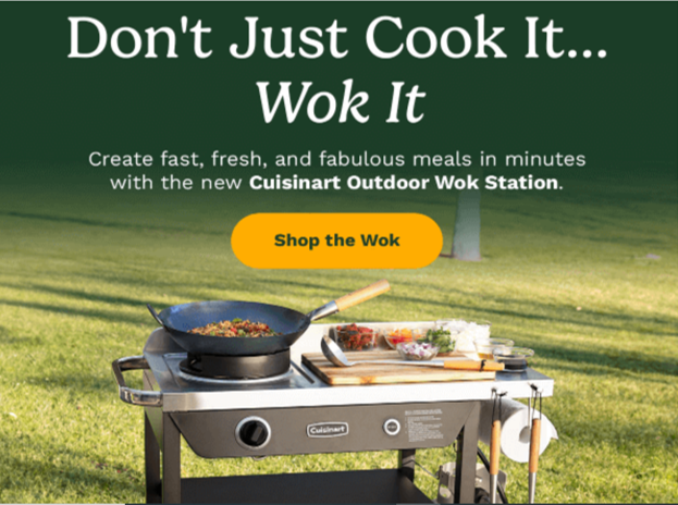
3. Add a call to action (CTA)
A CTA is a critical component you shouldn’t ignore. It should be clear and compelling and cause the reader to act.
For example, instead of the generic “Click Here”, try something more specific and engaging, like “Get Your Free Ebook Now.” You can try being even more creative: consider this “Shop the Wok” as inspiration:
Also, try to make your CTAs more personal. According to HubSpot, personalized CTAs perform 202% better than basic ones.
4. Consider your brand’s colors
Your brand’s colors should reflect your brand. An email banner is another way of representing your business.
You can play around with the design and size, but it’s always better to use similar background colors and follow the brand’s general guidelines.
In short, don’t use one color for your email campaigns and a different color for your website or social media platforms.
5. Link the email banner to your website
Make sure your banner links to your website or store. If you own a product store, linking to your product page instead of your homepage makes more sense.
If your email concerns a specific product, you can link the banner to that page on your website or store.
Also, use mobile-friendly links because 56% of marketers already incorporate mobile-friendly emails into their strategy.
How to Create an Email Banner
Follow the simple steps below to create an email marketing banner that is effective and visually appealing:
- Define the purpose of your email
What is the purpose of the email banner? Is it to announce an event, promote a new product, or offer a discount?
The reason is that it will help you develop email banner ideas for framing your message.
- Choose a design tool that works for you
You can choose from numerous design tools, like Canva, Venngage’s Banner Maker, or Photoshop. These tools already have templates.
You can choose one and make the necessary changes according to your brand’s guidelines, and you’ll be good to go!
- Get your brand’s elements
Get all the necessary brand elements, like your logo, specific fonts, colors, images, etc. Be consistent with your brand’s visual identity.
You can do that by making sure the layout is aesthetically pleasing and well-balanced.
If you want to keep a cohesive look, make sure the key elements of your brand identity are consistent in all your emails, like your logo, image, typography, etc.
For example, if your business uses a particular shade of blue and font style, make sure these reflect in your email banners.
- Start designing
Start your email banner design by including all the essential elements. Ensure that the layout is well-balanced and visually appealing.
For example, use your whitespace effectively, ensure your text is readable, and use a clean and organized structure.
Consistent color schemes and high-quality images can also improve the overall look. But make sure they all align with your brand.
Since you’ll be using the email header on various devices, make sure it looks good on both mobile and desktop devices.
- Test and make changes
After creating the banner, gather feedback from your colleagues and make the necessary adjustments.
You can use online surveys, create a shared document for your team members to leave comments on, or set up a feedback meeting to gather the feedback you need.
Keep improving it until it’s effective, functional, and visually appealing. After that, add the email banner to your email marketing campaigns and monitor its performance.
Best Practices for Creating Effective Email Banners
Now, let’s take a look at the best practices to implement when creating email marketing banners:
- Use sharp images for your email banners
Always use crisp and sharp images, whether you’re advertising a product or just setting the tone for your emails.
Blurry or pixelated images can affect your brand and turn off potential customers. Besides, why would anyone buy a product when they have to squint their eyes to see it?
That will only frustrate or annoy them, and they will probably delete the message. I know I would!
- Take the minimalistic route in your email header
You may be tempted to cram too many things on your banner, which is a terrible idea. Have you heard of the saying, “Less is more?” Use that approach here.
Adding every angle of your product and seven different colors or font styles will confuse your customers and turn them away.
Wisely use the negative spaces and keep the color and images to at most two.
- Create reusable email banner templates
You don’t have to create a new banner whenever you want to start an email campaign.
Sometimes, you must send emails quickly; the banner templates can be a lifesaver.
So, come up with many email banner ideas for your templates to save time and effort.
Recommended Dimensions for Email Banners
It’s crucial to consider dimensions when creating email banners to make sure they look great on multiple devices.
Email marketing banners should ideally have a width of between 600 and 700 pixels.
Your audience will have a consistent and eye-catching email experience with this size, which fits most email clients and devices correctly.
You can vary the height of your email banners, but it should always be in line with the width and the amount of text.
For example, you might need a taller banner if your design has a lot of text or multiple elements. However, a shorter height would be more appropriate if it’s more image-focused with less text.
To Sum Up
When it comes to email banners, you need to consider many things because they vary from one industry or audience to another. So, what works well for one brand may not work for you.
How do you find out what works for you? Simple: test them.
Implement all the points we’ve discussed, monitor your bounce and click-through rates, and take the best action.