- Home
- Science-Backed Marketing Insights
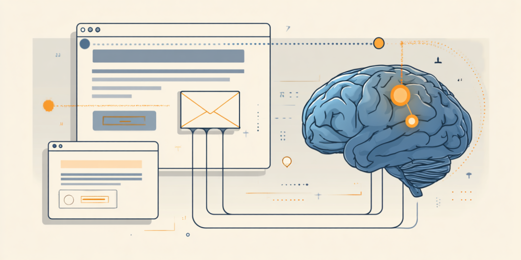
- Cognitive Load Theory in Email ...
Let’s start with a simple truth: the brain can only take so much. And the main reason why people don’t engage with your email is because you’ve unknowingly asked too much of a tired brain.
In marketing, we like to think of our emails as little moments of persuasion. But from the reader’s perspective, it’s just one more decision to make in a day full of them. One more mental task stacked onto an already overloaded system.
While it is not possible to avoid mental overload, it is possible to work around it. For that, it is important to know the basics of cognitive load theory. Born out of educational psychology in the late 1980s, this theory was originally developed by John Sweller to explain how we learn. But its principles turned out to be equally useful to understand how people interact with marketing content.
In this article, we’ll walk you through the basics of cognitive load theory, why it matters in email UX, and how, by reducing the complexity of your email design, you can achieve better comprehension and more clicks and learn to make emails that get read. You’ll also understand that the science is surprisingly intuitive once you see how it works.
The Basics of Cognitive Load Theory
What is cognitive load theory? In short, it is a framework for understanding how much mental effort something requires. And it tells us one crucial thing—your audience’s working memory is not a bottomless pit.
Cognitive load theory explains that when you overload that system, even good messages cannot be processed, as the brain simply tunes out. It leads to engagement drops, and your emails do not get the attention they require because at a certain moment it is perceived as too much.
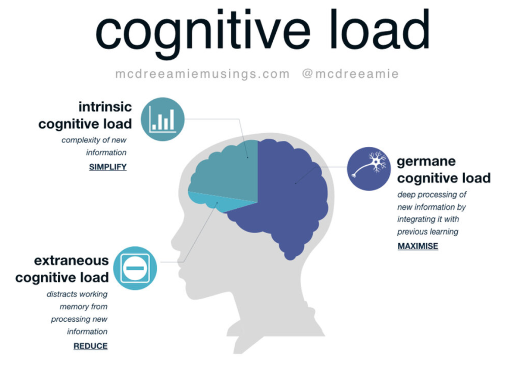
Sweller (1988), in his work about the effect of cognitive load on learning, broke this concept into three types of mental load:
🔷 Intrinsic load: This is the unavoidable complexity of the thing you’re trying to say. For example, an email that explains a new billing structure will naturally require more brainwork than one announcing a 20% off sale. You can’t get rid of this load—but you can present it more clearly.
🔷 Extraneous load: This is avoidable complexity. In emails it looks like confusing layouts, inconsistent fonts, walls of text, or just too many competing buttons. It’s the stuff that doesn’t help comprehension but still demands mental energy. This is the load marketers shall actively reduce.
🔷 Germane load: This is a good kind of effort. The part of the brain that says, “Oh, this makes sense. Let me connect the dots.” In a way, this is the load we want to encourage—because it means someone’s actually engaging with your message.
This classification provided by Sweller shows us that not all cognitive load is bad. Any type of email requires some mental processing, and you can’t change the nature of your message. But you can absolutely shape it in a way that it is easy to comprehend.
What Is Cognitive Load Theory in Design?
When we talk about cognitive load theory in design, we’re talking about how visual and structural choices in your email either support the brain’s natural processing or sabotage it. Sweller’s model breaks cognitive load into three categories: intrinsic, extraneous, and germane. But not all of these are within your control as a marketer or designer.
Here’s where your influence lies:
What marketers and designers can influence
✅ Extraneous load
This is where you have the most control, but it is also where most problems happen. Extraneous load comes from how the information is presented, not what it is. If your font is hard to read, or your CTA is barely visible, you’re making the reader’s job harder. The brain starts to burn energy on decoding layout instead of understanding messages.
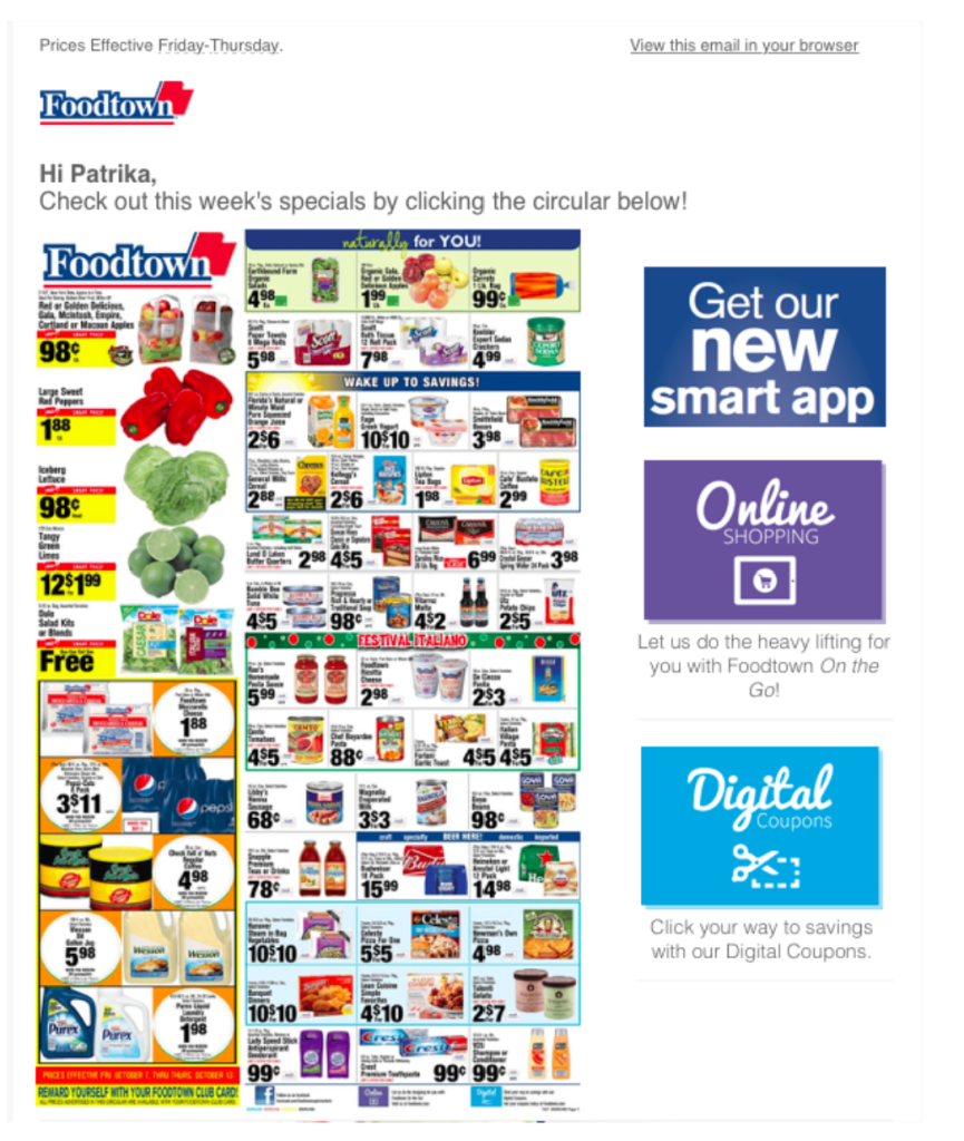
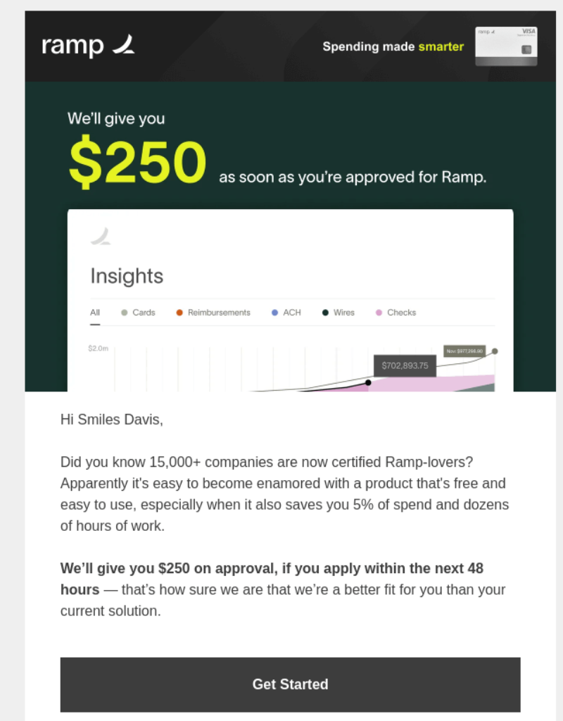
Example of an email that causes high level of extraneous load
✅ Germane load
While you can’t force someone to think deeply about your offer, you can design it in a way that invites meaningful engagement. Clean hierarchies, intuitive flow, and clear labels support germane load—the good kind of effort, the one that helps readers understand your message and apply it.
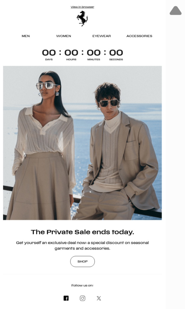
Example of an email with high germane load
What marketers can’t influence
⚠️ Intrinsic load
This is the inherent complexity of the content itself. A pricing matrix will always require some analytical thinking involved. You can’t remove this load, but you can make it feel less intimidating by simplifying how it’s introduced, broken down, and visually presented.
Example of an email with high intrinsic load
The Effects of Information Overload in Email
It is easy to underestimate how quickly digital content overwhelms us. Even before our morning coffee kicks in, we are already affected by dozens of emails mixed with the world news and social network reels.
If cognitive load theory explains how our brain processes new information, then cognitive overload is what happens when it’s asked to process too much at once. The cognitive overload definition in psychology describes it as a state in which the processing demands of a task exceed the cognitive capacity of the individual. In plain terms, it is the state of the mind when a user is lost for content processing.
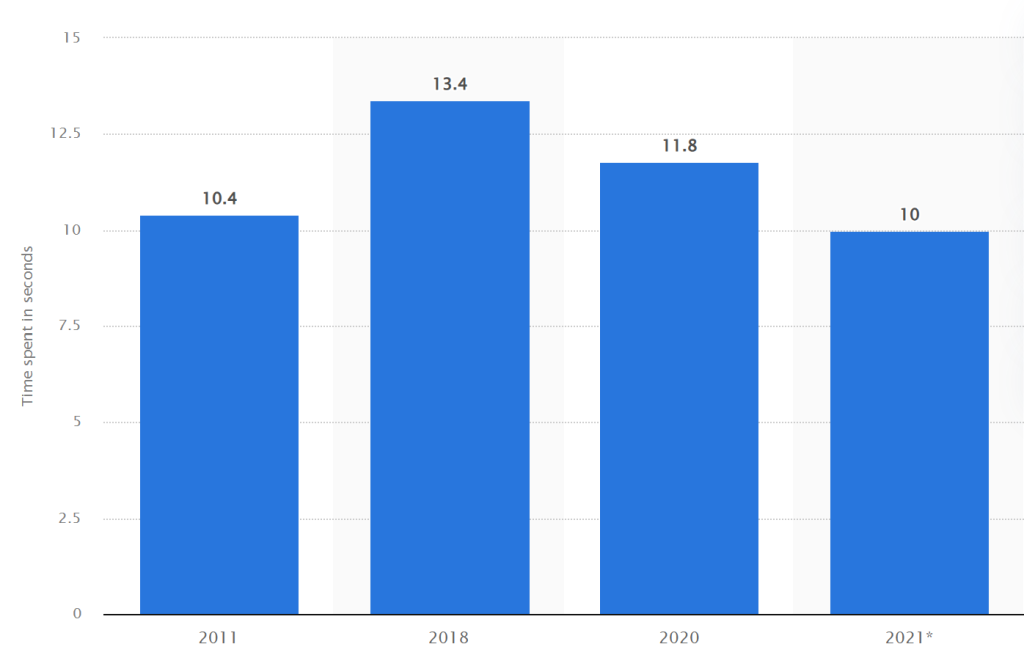
And it doesn’t take much for this moment to happen. According to Statista, the average time users spend reading an email is about ten seconds. That’s it. Ten. In those few seconds, your reader’s mind is trying to comprehend:
❓ What is this?
❓ Why should I care?
❓ What should I do next?
If your design makes it hard to answer any of those questions quickly, you’re adding extraneous cognitive load—the kind that drains energy and slows decisions. As a result—your emails barely have any chance left for being acted upon.
Average time people spend reading brand emails
Decision fatigue, attention fragmentation, and the cost of “doing too much”
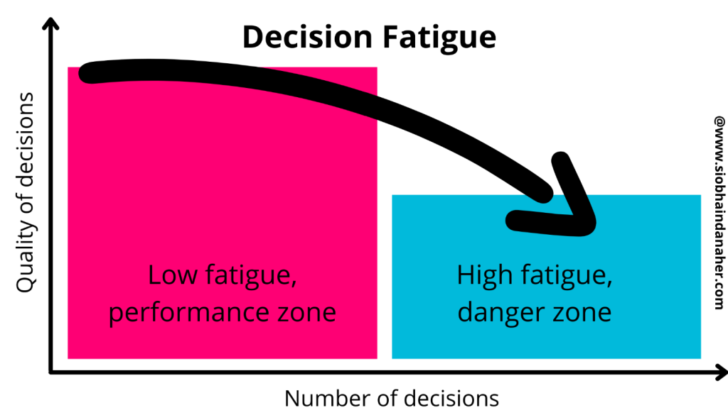
When crafting your campaign, consider that every option you add, every product image or block of text adds to the total mental effort required to make a decision. Psychologists call this decision fatigue—the idea that the more choices we make, the worse we get at making them. By the end of a long day, even choosing between two buttons—Shop Now or See More—can feel like a drag.
A 2023 study by Schweitzer et al. confirmed this: people faced with too many decisions experience depleted willpower and are more likely to avoid action altogether. In email, this often translates into non-clicks.
On top of that, user engagement is affected not only by a lack of focus but also by attention fragmentation—a concept that refers to the mental state in which a person’s focus is constantly being pulled in multiple directions by notifications, multitasking, content overload, or simply the fast pace of digital life. Instead of engaging deeply with one thing, the brain skims across many, often without fully processing any of them. This is where cognitive load in marketing becomes a real obstacle. Too much input, and the brain simply checks out.
This is why email design psychology has started to focus less on “more features” and more on simplicity and cognitive flow. Your job as a marketer is no longer to impress with design or colors, but to make the decision-making process easy for the user.
Applying CLT to Email Design
Now, when we understand that too much cognitive load can sink even a successful campaign, the next question is: what can we do about it?
The good news is that a lot of the cognitive load UX mistakes we make in emails are design-based. It means they can be easily fixed by changing how it’s presented. You do not need to change your campaign’s message for that.
Below are some of the most effective, science-backed techniques for reducing unnecessary mental effort and keeping your reader’s brain working for you, not against you.
1. Design for one decision, not five
Your reader should never have to wonder, “What am I supposed to do here?”
A common cause of cognitive overload in marketing is giving users too many choices. One study from Columbia University, referred to as a jam study, found that people presented with six options were ten times more likely to make a decision than those presented with twenty-four. This same principle applies to email CTAs.
Instead of using:
- Explore the Collection
- Shop Women’s
- Shop Men’s
- See What’s New
Try:
- Shop the New Collection (with smart segmentation handling gender or preferences behind the scenes)
2. Use visual hierarchy to guide attention
In cognitive science, attention is often described as a spotlight that is limited in scope and depth. Your design should guide that spotlight with the layout. To ensure that your layout guides user attention towards the most important part of your emails, use:
- Larger, bolder headlines to anchor the message
- Clear CTA buttons (not hyperlinked text lost in a paragraph)
- Ample spacing around key elements to give the brain room to breathe
- Contrasting colors that support—not compete with—your CTA
3. Chunk your content
Our brains naturally group things. This is part of gestalt psychology, but it shows up in cognitive load theory too: information is easier to process when it’s broken into smaller, meaningful parts.
👉 Try breaking long paragraphs into short write-ups, using:
- Bullet points
- Subheadings
- Icons or visuals to separate sections
- Highlighted quotes or stats
This reduces extraneous cognitive load and supports germane load—the productive mental work that helps users actually understand what you’re offering.
4. Remove distractions
In email UX terms it means: stop crowding the screen.
Visual distractions—like flashing gifs, overlapping modules, inconsistent font sizes, or three different fonts—pull your reader’s attention in conflicting directions. That creates split attention—a state where comprehension drops together with retention.
👉 Check your next email for:
- Redundant elements
- Extra CTAs
- Design flourishes that don’t serve the message
- Low-value links (like footer banners for things unrelated to the offer)
Ask, “Does this element help the user act or distract them from acting?”
5. Design with cognitive accessibility in mind
Cognitive overload doesn’t affect everyone the same way. For neurodivergent readers or anyone with attention or processing challenges, even small design choices can feel like a barrier.
👉 Apply best practices like:
- Clear, simple sentence structures
- Avoiding dense or academic jargon
- Using descriptive headings
- High color contrast and legible fonts
- Avoiding animations that auto-play or loop endlessly
Good cognitive load UX has nothing to do with “dumbing down” your content. By simplifying the perception of your message, you are clearing a path, so the value of your message is obvious, no matter who’s reading it.
To Sum Up
Understanding the types of cognitive load gives us language for what we intuitively feel when a message just feels “too much.” But more importantly, it gives us tools to fix it. When it comes to email marketing, the idea of cognitive overload meaning stops being just academic—it becomes highly practical. It’s something that happens to your users more often than you realize. It might be the reason behind that ignored CTA, the skipped paragraph, or the design element that looked great on paper but demanded too much from an already distracted brain.
As marketers, we’re not just competing for attention anymore—we’re learning to design for limited attention spans, fragmented focus, and mental fatigue. And by understanding these scientific principles and putting them into practice, you start speaking the brain’s language—and in return it gets willingly engaged with your content.