- Home
- Email Tips and Tricks
- Email Heatmap: How to See Wher ...

To really know and understand what our clients, customers, users, and readers think is the dream of most marketers. It would unlock the full potential of any marketing campaign—just imagine you’d know which line of your email really works and which one makes clients close the email instead.
Marketers have many tools to get closer to this understanding, but most are limited either in what they can show or in how easily they can be used. In this article, we want to showcase one of these approaches that might get you closer than anything else. We will talk about an email heatmap. Once you’re able to use this approach, you’ll be one big step closer to fully understanding how your readers actually behave when reading your email.
What Is an Email Heatmap?
An email heatmap is a visual representation of how people interacted with an email: it highlights which parts of your email got clicks and how many subscribers clicked them. It looks like an image of your email with colored “hotspots” over each link, button, or clickable element, along with percentages or numbers indicating the click rate. This heatmap tracking allows marketers to see email elements that were popular and those that were not.
Email heatmaps vs. website heatmaps
You might be familiar with website heatmaps. Email heatmaps serve a similar purpose but have key differences. Website heatmaps can track a variety of behaviors, like where users move their mouse, how far down they scroll, and where they click on a page. Emails, by contrast, are a more static environment. This means an email heatmap primarily focuses on clicks. Essentially, a website heatmap gives comprehensive user interaction data, whereas an email heatmap is mainly a click heatmap showing you where subscribers clicked in the email content.
“Hot zones” vs. “cold zones”
The term “heatmap” comes from the color coding used to define levels of engagement. Areas with high engagement (lots of clicks) are shown in warm colors like red or orange—these are your hot zones. Areas with little to no engagement get cooler colors like blue or none at all and define cold zones. These visual cues let you pinpoint where readers focused their attention and the spots they decided to skip. This hot/cold visualization makes it very easy for anyone to interpret email performance, even without numbers.
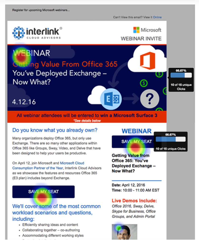
Email heatmap example
How Email Heatmaps Work
💎 Link tracking basics: Email heatmaps are powered by link tracking. What does that mean? When you send a marketing email, most ESPs use special tracking to record clicks. In many cases, your email platform adds a tiny invisible image called a tracking pixel and changes your links a little. The pixel loads when someone opens the email, so the system knows it was opened. At the same time, each link is rerouted through the platform’s server before taking the reader to the final page. This way, every time a link is clicked, the system can record it. It might sound complicated, but it all happens in milliseconds and is invisible to the user.
💎 Rewritten links & data aggregation: Rewriting links for tracking is how email heatmaps gather their data. The email platform adds a redirect or unique ID to each link in your email. When a subscriber clicks, they hit the tracking server, which records the click and forwards them to the actual destination URL. This process captures which link was clicked and can even tie it to the specific subscriber or campaign.
Over the course of your email send, the system aggregates all this click data, which is compiled in the background. Modern platforms handle this automatically—you just have to enable “click tracking” in your email settings, and the platform will do the rest. By the end of the campaign, you have a dataset of each link and how many times it was clicked (and by how many unique users).
💎 Heatmap visualization in email tools: Once the data is collected, your email platform shows it as a heatmap overlay. In your campaign report, you’ll see your email with click data layered on top—links and buttons highlighted with colors or bubbles showing how many clicks they got. For example, Mailchimp’s Click Map displays clicks right on your email design, making it easy to spot the most popular areas. Many tools also let you compare desktop vs. mobile views or unique vs. total clicks. It’s a quick, visual way to see what’s hot and what’s not in your email.
Why Use an Email Heatmap
👉 Improve CTA placement
A heatmap immediately shows you whether your important buttons or links are in the right spot. Marketers can use these insights to rearrange content so that key CTAs sit in the hot zones. In fact, heatmaps take the guesswork out of where to put a button, as you can literally see which sections draw the eye. If most clicks cluster near the top of the email, you’ll want your main click heatmap goal (like a “Buy Now” button) in that hotspot.
👉 Understand subscriber behavior
While traditional email reports might tell you your email had a 20% click-through rate, they don’t show how readers navigated your content. Heatmaps do. By examining which sections of your email attracted clicks, you start to understand what your audience cares about.
For example, you might discover that almost no one clicked on an image gallery at the bottom of your newsletter, but a lot of people clicked a text link in the intro—indicating they prefer that type of content or placement. Heatmaps let you see the email through your subscribers’ eyes so that you can adjust future emails to match these behaviors.
👉 Identify distractions and weak spots
Another great use of marketing heatmaps is spotting parts of your email that might be distracting or underperforming. Sometimes, elements you include, like a social media icon, can unintentionally steal clicks from your main message. A heatmap will expose this. For example, you might see a hot spot on your email’s header logo (meaning many people clicked your logo instead of the promo inside the email). You can consider removing or changing elements that attract “false” attention or no attention at all. Heatmaps even help catch odd patterns, like if users are clicking something that isn’t actually a link (which can happen if, say, a phrase looks like a hyperlink but in fact isn’t).
👉 Validate A/B test results
If you run an A/B test on two email variants, the usual metrics will tell you which version got more clicks overall—but not why. This is where the heatmap becomes so useful. By looking at the heatmaps for each version, you can visually compare how subscribers engaged with the different layouts. Perhaps, both versions had similar click-through rates, but the heatmap reveals that in Version A, everyone clicked the top banner, whereas in Version B, clicks were more spread out. That insight might explain differences in conversion quality or inform what to test next. Experts often use them to double-check that an A/B winner truly owes its success to the element being tested.
Types of Data You Get from an Email Heatmap
✅ Click distribution across elements
The primary data an email heatmap provides is the distribution of clicks across all the elements in your email. You can see, for example, that 50% of all clicks were on your main hero image, 20% on a text link in paragraph two, 15% on the footer link, and so on. This breakdown can be further understood by element type—you might notice that buttons tend to get more clicks than plain text links, or that images are attracting clicks even when they’re not explicitly CTAs (perhaps, people click product images expecting them to link to product pages). With that information, you learn what kinds of content or link placements work best.
✅ Device-level insights
Many email heatmap tools also provide data segmented by device, giving you insight into desktop vs. mobile engagement patterns. This is increasingly important, since a large portion of subscribers read emails on mobile devices. Device-specific heatmap data helps you optimize your email design for each environment. If your heatmap shows that mobile users hardly clicked your right-column content, it could be because on mobile that content falls way below or is formatted differently. You’d then prioritize and rearrange key content for a single-column mobile layout. Knowing the tap behavior on mobile versus the click behavior on desktop can guide responsive design decisions.
✅ Unique clicks vs. total clicks
Unique clicks tell you how many individual subscribers clicked a given link at least once, whereas total clicks count all clicks, including multiple clicks by the same person. The heatmap interface often shows one or the other by default (often percentage of total clicks), but detailed link info will include both. This matters because a link might have, say, 100 total clicks but only 80 unique clickers—which means some people clicked it more than once.
If you see a big gap between unique and total clicks on a link, it indicates very high interest (or possibly confusion) from some users who clicked repeatedly. Unique clicks, on the other hand, are great for understanding how broad the engagement was. If only a small number of people clicked, but they clicked many times, that’s a different scenario than many people each clicking once. Both metrics together give a fuller picture, and having this data helps validate engagement quality.
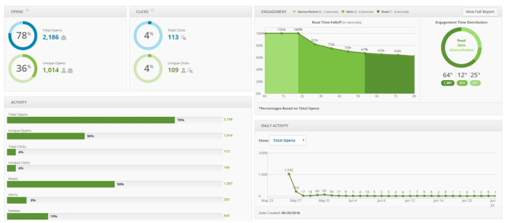
Example of an email campaign report with a heatmap from Email on Acid
Limitations of Email Heatmaps
⚠️ No scroll or mouse tracking
Unlike website heatmaps, emails can’t track scrolling depth, hovering, or mouse movements because email clients don’t allow JavaScript or other interactive scripts. That means an email heatmap is essentially a click map only. You’ll know where clicks happened, but you won’t know how far people scrolled or where their attention stopped. For instance, if no one clicks a link near the bottom, it might mean they never scrolled that far, but you can’t confirm it with heatmap data alone.
Similarly, you won’t see attempted clicks on non-linked images or words, since those actions aren’t recorded unless a link is there. In practice, heatmaps tell you what was clicked, not what was seen. To fill this gap, marketers often pair heatmap insights with other data, such as read time metrics.
⚠️ Impact of Apple’s Mail Privacy Protection
Apple’s Mail Privacy Protection (MPP) has reshaped how email analytics work since its launch in 2021. Because Apple downloads email images automatically as soon as an email hits the user’s inbox, it makes open rates look higher than they really are, so any metrics based on opens can’t be trusted. For heatmaps, this means any attempt to measure views, time spent, or percentage of readers reaching the bottom of an email becomes skewed. The positive side is that click tracking remains intact: Apple doesn’t simulate link clicks, so your heatmap still shows real engagement with buttons, images, and links. However, marketers should interpret results carefully: if open rates look unusually high but clicks remain steady, the inflated data is likely due to MPP. Click-to-open rates also lose accuracy under these conditions, since the “open” denominator is artificially large.
⚠️ Image blocking can reduce accuracy
Another limitation comes from image blocking, which is common in certain email clients or corporate settings. If images are blocked, tracking pixels may never load, meaning those opens aren’t counted, and any image-based buttons or banners might appear as blank spaces. As a result, these areas may show up as cold zones on a heatmap, not because they were ignored, but because they weren’t even visible. This can underreport engagement for image-heavy designs.
To reduce the problem, marketers should design emails that remain functional without images: add alt text, include HTML-based buttons, and provide text links alongside graphics. While image blocking doesn’t stop link clicks from being recorded (a link will still register if visible), it does distort the full picture of how readers are engaged. In practice, a “cold” section might not always signal weak content; it could reflect the technical limits of image rendering.
Tools That Provide Email Heatmap Tracking
These days, many popular email marketing services offer heatmap or click map features as part of their analytics. Mailchimp, HubSpot, ActiveCampaign, Campaign Monitor—to name a few—all provide some form of visual click tracking for your emails.
- Mailchimp—Mailchimp’s Click Map overlays your campaign with clickable hotspots, showing what percentage of clicks went to each link. You can also compare desktop vs. mobile activity to see how device choice affects engagement.
- HubSpot—Includes an HTML click map inside each sent email’s Performance tab. It visually highlights all clicked links and shows each link’s rank and % of total clicks; note that HubSpot groups clicks to the same URL unless you make each instance unique.
- ActiveCampaign—Natively provides detailed clicked-links reporting (lists, totals, unique, etc.), but not a native heatmap overlay. If you want a visual click heatmap, use a third-party integration like EmailHeatmaps (connects via API).
- Campaign Monitor—Offers a link activity & email overlay view that shows where people clicked on the email design (a visual heatmap-style overlay) alongside standard metrics. Good for spotting high-engagement buttons and sections quickly.
For teams that need more than basic click maps, premium platforms like Litmus or Email on Acid offer deeper analysis. These tools can track additional data points like read time, engagement by device, and even predictive eye tracking. They’re often used by larger organizations or marketers who want to validate designs in detail before sending high-stakes campaigns.
To Sum Up
Email heatmaps are a handy and very visual way to understand your email campaign’s performance. Instead of just telling you the overall click-through rate, a heatmap shows you where people clicked by mapping your subscribers’ interest onto your email content. It allows marketers to quickly spot which parts of their emails are working and which parts aren’t.
By using heatmaps alongside your other email metrics, you’ll be equipped to continuously improve your campaigns—placing important content in the right spots, eliminating distractions, and ultimately creating emails that your subscribers find more engaging.