- Home
- Email Tips and Tricks
- Images in Emails: How Many Bef ...

We’ve always liked visuals. Maybe it is about what — what emotions we feel when looking at colorful images — or maybe it is about how — how our brain processes the info hidden behind them. Either way, we’ve never stopped using them. What’s changed is the way we use them.
Even though marketers have gone a long way from packing emails with product shots to designing balanced responsive layouts and even though in this modern world our attention spans are shorter than ever, images still have a place. A big one, actually. They just needed to earn it anew.
In this article, we’ll break down why images in emails still matter, how our brains respond to them, and what marketers need to know about keeping that all-important balance. We’ll cover deliverability, best practices for text-to-image ratio in emails, and the evolving role of visuals in email marketing—supported by facts and figures.
Why Images in Emails Matter
We’ve always been drawn to pictures. Our brains are wired to process visuals faster than text—60,000 times faster, according to some studies. That instinct hasn’t changed, even if the medium has. Which is probably why, when HTML emails first entered the scene in the late 1990s and early 2000s, the first thing marketers did was try to fill them with images.
At first, it made sense. Digital newsletters were modeled after physical ones—and designers would simply export one big image of the layout and paste it into an email. No need for formatting or structure. It was easy —and, by today’s standards, it was a nightmare.

Of course, spammers used it to their advantage and to bypass content filters. Instead of writing “free money,” they’d slap it into a bright red JPEG and hit send. It worked for a while, but eventually, inbox providers pushed back by blocking images by default, downgrading email reputation, and filtering aggressively. And just like that, a tool once praised for its creativity became a liability for many.
But here’s the thing: we never stopped liking images. We just got smarter about how to use them.
Today, images in emails aren’t just decoration—they’re part of the narrative. Especially in email marketing, where attention is everything and visuals often determine whether someone clicks or not. A well-placed image can instantly show off a product, explain a process, or give an email that scroll-stopping edge.
Since the rule “all or nothing” does not work for images in emails, we are left with no choice but to balance the text-to-image ratio in emails. This is where a 60/40 rule comes in—not as a hard law, but as a helpful guide.
So, images in emails are still very alive. They’ve just grown up and transformed. And if you’re going to use them—which you should—make sure you’re doing it in a way that helps your message, not hinders it.
Potential Problems with Too Many Images
As we’ve just figured out, images are great—when used in moderation. There’s a point where the thing that makes your email attractive can also start sabotaging it. Not all at once, but in subtle ways that add up to fewer opens, fewer clicks, and sometimes, fewer emails even making it to the inbox. Why does that happen?
Example of an email with too many images

1. Spam filters may flag your email
Back in the early days, spammers loved images because filters couldn’t “read” them. That led to a whole generation of image-heavy emails landing in the junk folder. And while spam filters have evolved, the memories stayed. If your email has very little text and lots of pictures, that ratio can still raise a red flag about your email reputation. If your sender history is clean, you’ll likely be alright. But if you’re new—or your domain already has a few strikes—then too many visuals might tip things in the wrong direction.
2. Longer load times & poor user experience
We live in a world of “tap, scroll, decide.” If your email takes longer than a second to load on mobile, you’ve already lost someone. Oversized images or too many of them can slow things down, especially when connections are spotty. What’s worse is that your beautifully crafted visuals might never get seen. So, unfortunately, a slow email is a dead email—and that is something to keep in mind.
3. Blocked images in some email clients
One of the main disadvantages of email images is that some email clients still block them by default. Outlook is infamous for this. So, if your entire message is locked inside a few image blocks and there’s no fallback text, your email arrives looking like a blank canvas. It’s not just ineffective but also looks awkward. And in email marketing, where attention spans are tiny and competition is cruel, such mishaps can cost a lost conversion, a damaged reputation, or both.
4. Email size can exceed inbox limits
The unfortunate truth is that large emails can get clipped or rejected altogether. For example, Gmail trims emails over 102KB. If your reader doesn’t scroll down far enough to see the View entire message link, they might never even see your call to action. And this doesn’t just affect images—it can also impact whether the email gets delivered altogether.
What’s the Ideal Image-to-Text Ratio, and Why?
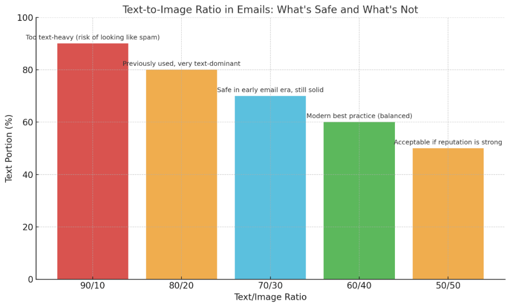
The 60/40 rule still holds—for good reason
This golden ratio is a reflection of what mailbox providers trust nowadays. Having at least 60% text and no more than 40% image gives filters the right context—and keeps your email reputation safe. This is especially important when you’re still warming up your domain or trying to rebuild trust after deliverability issues. If you’re wondering how to improve email domain reputation, this ratio is a great place to start.
Other ratios have existed—but they didn’t stick
The 60/40 ratio was not always a golden rule. Back in the day, some marketers swore by 70/30 or even 80/20 text-to-image ratios. It happened because early spam filters were far more suspicious of anything image-heavy. On the other hand, overly text-dense emails ran the risk of looking like spammy copy-pasta. Neither extreme aged well.
Today, the 60/40 rule remains the sweet spot, but it’s not the only acceptable ratio. As long as you have at least 400–500 characters of body text and well-balanced visuals, you’re in a safe zone—even if your ratio lands closer to 50/50.
Younger generations scroll fast—make it count
Even if your email domain reputation checker gives you the green light, don’t forget the human side. Today people read emails differently than they used to. That is especially true for Gen Z, who have a truly micro-attention window. That’s why you need images—to break up the wall of text—but not so many that it looks like a collage. When you send an email with a solid text-to-image ratio, you get a similarly balanced engagement vs. overwhelm outcome. And that, in itself, is good marketing.
Modern email clients still don’t love all-image emails
Despite the advancements, platforms like Outlook and Yahoo still default to blocking images. That’s where your image-to-text ratio email marketing strategy needs a plan B. If your core message only lives in pictures, you’re one “don’t load images” setting away from a blank canvas. So, good fallback text and smart balance are your insurance policy.
Best Practices for Using Images in Emails
⚡ Don’t rely on images alone
This one might already sound like a broken record, but again—don’t craft your emails only out of images. It could fly in the early days, but today, if your email has no readable text, it screams “spammy” to the algorithms. That’s when your email reputation gets hindered. If your sender score is strong, you might fly under the radar—but if you’re new or have a shaky history, relying solely on visuals is risky. Instead, aim for a solid text-to-image ratio in emails and keep your message accessible even if no image loads.
⚡ Watch the file sizes
We’re in the age of speed. If your email takes more than a couple seconds to load on mobile, you’ve already lost half your audience. Oversized visuals—or too many of them—don’t just frustrate readers but also flag mailbox providers during the domain reputation check. Keep your images compressed, clean, and purposeful. Your emails should be fast, not sluggish, and sleek visuals should never come at the cost of a smooth user experience.
⚡ Plan for image blocking
Even in 2025, not every email client is image-friendly. Outlook, in particular, still loves to block them by default. So, if you’re not including alt text or fallback content, your beautiful design might show up as a bunch of empty boxes. That’s why images in emails need support—both from real text and clear CTAs.
⚡ Use fewer, better images
A carousel of product shots might sound like a good idea… but you might want to leave this idea for a paper flyer. With emails, instead of overloading, pick 1–2 great visuals that do something. Do they guide a user to a CTA? Do they show real value? If not, then they probably do not belong in email at all. When you check email domain reputation, one of the things you’re checking is consistency—and consistently bloated emails aren’t a healthy sign.
Final Verdict: How Many Images Are Too Many?
Images in emails can absolutely elevate your message. By working alongside your text, they help tell your brand’s story. But there’s a fine line—and when you cross it, the very thing that was supposed to help starts doing the opposite.
Too many images can tank your email reputation, especially if there isn’t enough text to provide context. Spam filters still watch the image-to-text ratio closely, and even your most stunning design won’t mean a thing if it lands in the junk folder.
The best email design is not about stunning images—it is about knowing how to walk the fine line between creativity and clarity. By keeping the right text-to-image ratio in email, you give your content a beautiful kick, increasing the chances for your email to be seen along the way.