- Home
- Email Tips and Tricks
- Responsive Email Design: Best ...

Responsive email design. Well, of course, we all want a response to our emails. That’s why we send them out in the first place. But this is not what responsive email design is about. Rather, it is about making sure that your email looks good on every device. Of course, you might assume it is the year 2025—everybody reads their emails first on their phone anyway. Or on their tablet. Or sometimes on their computer. You see the point—there are a lot of different device types, operating systems, mail apps, screen sizes, and so on.
According to recent data, the average number of devices owned by one person worldwide in 2023 accounted for 3.6, with people in developed markets such as North America owning up to 13 devices. Of course, not all of those gadgets are smartphones and laptops, but the trend is obvious—the way people access their inbox has become increasingly fragmented, and your email has to be ready to perform on whatever screen it happens to land.
In this article, we’ll take a closer look at what responsive email design really means, why it’s essential in modern email marketing, and the responsive email design best practices that can help you build emails that look right—regardless of what screen you prefer to read them from.
What Is a Responsive Email?
If you think about something that never goes out of style, you might as well think about a responsive email, because a responsive email is meant to fit wherever it lands. And with the growing variety of different devices we use, it’s getting more and more trendy.
What is a responsive email, exactly? It’s an email that adapts to the screen it’s being viewed on. No matter whether you’re opening your email on a 27-inch monitor, a phone screen, or something in between, a responsive email will always look nice. It will resize and adapt itself exactly to the type of device you’re using. So, you won’t need two fingers and a prayer to zoom in.
If you are still not convinced that responsive email design is something crucial to have, it might be helpful to look at some data. Currently Gen Z represents almost 25% of the world population, which makes them the largest generation group in the world. At the same time, 67% of Gen Zs use their smartphones for checking emails. So if your email doesn’t look good on a phone, you are potentially losing the attention of the largest, most mobile-first generation on the planet.
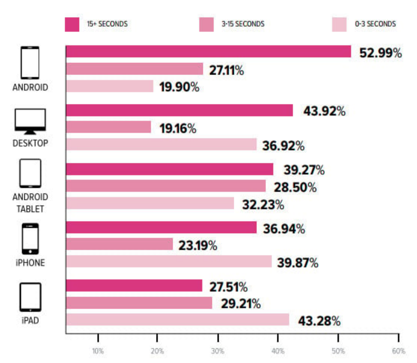
How long users of different devices spend watching emails
Why Responsive Emails Are Non-Negotiable in Modern Email Marketing
Why does it matter today more than ever? Because most emails today are opened on mobile, which makes email responsiveness an equivalent of your campaign’s success. It’s the difference between an email that feels and looks natural and one that makes your reader work for it. And let’s be real—they won’t, because the competition is high, and there will always be someone who gets responsive email design better.
When your email doesn’t display properly, for sure it looks bad—but the problem is bigger than that. It also interrupts the reading experience. Instead of being useful, it turns the whole interaction into frustration and annoyance—especially considering the fact that the attention span of contemporary readers is quite short. People most likely won’t be trying to figure out what you were trying to say with your tiny fonts or make multiple attempts to click buttons they can barely find.
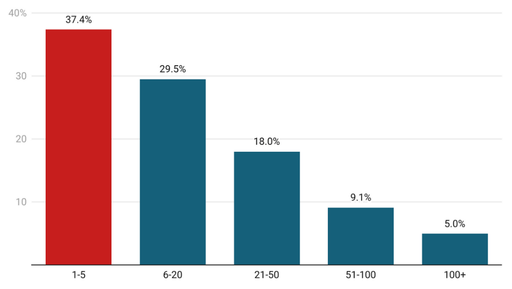
Number of emails received by Gen Zs per day
That’s why the role of responsive email design nowadays is not so much about avoiding mistakes or creating great visuals but about helping you meet expectations. People might have no idea what the term “responsive email” means or what mobile email design technically involves—but they know when something works. And it’s exactly this feeling, this impression of being effortless, that makes them remember you—sometimes just as much as the quality of your product or service.
Responsive Email Design Best Practices
⭐ Layout & structure
Start with the basics. A good responsive email layout is clean and flexible and knows how to stack when it needs to. That’s why single-column layouts are often the safest bet—they flow well on mobile and desktop alike. Avoid anything too complex or fixed in width. The simpler your structure, the better it can adapt when space is limited.
⭐ Typography & readability
If your text is hard to read, it does not matter how good your copy is. So, keep your fonts readable across all devices. That usually means at least 14px for body text and a little larger for headlines. Leave enough spacing between lines and don’t crowd your paragraphs. A responsive email should never ask the reader to zoom in just to get through the first sentence.
⭐ Calls to action (CTAs)
Your CTA is what turns a good email into a useful one. In a mobile responsive email, your button needs to be big enough to tap with a thumb and far enough from other elements to avoid accidental clicks. Another important tip—make it easy to find.
⭐ Images & media
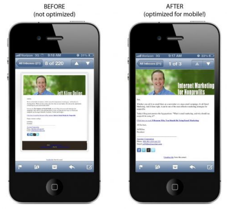
Visuals can make or break the whole feel of a responsive email. Use images that scale with the screen and always add alt text in case they don’t load. Keep file sizes light so the email doesn’t lag, and avoid placing important text inside images (because it might disappear on mobile).
⭐ CSS & media queries
Media queries help your design respond to different screen sizes by adjusting styles like font size, padding, or column layout. Combined with smart inline CSS, they let your email change shape without losing structure. It’s what makes one version of your email work everywhere.
⭐ Testing & compatibility
You might think your responsive email looks great—but does it still work in Outlook? On an older Android device? In dark mode? The only way to know is to test. Use tools that let you preview your email across clients and devices, and always send test emails to yourself before launch.
To Sum Up
In this article, we tried to show from different angles that responsive email design is something unavoidable in contemporary email marketing. It’s crucial to make your emails look good across all devices—and especially on mobile phones, considering how popular they are among the biggest generation groups.
But even statistics aside, adaptive, responsive emails are simply intertwined with the way contemporary life works. We’re interconnected through devices, social platforms, apps, mail agents—and having an email that looks as good on a laptop as it does on a phone is just as natural as being able to log in to a new dating app through your Gmail account. It’s expected.
So, if you really want to build effective email campaigns, be prepared to treat responsive email design not as a bonus, but as one of the most basic—and most important—requirements.
 Your Privacy Choices