- Home
- Email Tips and Tricks
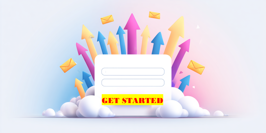
- Squeeze Pages: The Secret Weap ...
Squeeze as much information as you can into one paragraph. Squeeze a few more images into this article. Squeeze as many buzzwords as you can into your LinkedIn post. Lots of ado about squeezing—and still none of it has anything to do with a squeeze page.
A squeeze page is a super compact and easy-to-comprehend page dedicated to collecting email addresses. In many cases this will be the first interaction your audience has with your company. Make sure that your squeeze page stands out, positively, without taking away from the overall experience. Otherwise, it might also be their last interaction with your brand.
In this article, we will talk about squeeze page definition and discuss how to make a squeeze page better by applying psychology and specialized tools.
What Is a Squeeze Page?
A squeeze page, by definition, is a single-purpose web page designed to collect a visitor’s email address. It does not have any extra links or footers with a hundred other things to click on. Just one message, one offer, and one simple form. It “squeezes” the email out of the visitor—hence the name.
The simplest way to think about a squeeze page is by seeing it as a focused conversation. And in this conversation you are offering one valuable thing—it can be an ebook, a discount, or a checklist—in exchange for an email.
Most often, squeeze page examples are used at the top of the funnel. Someone lands on the page, sees the offer, thinks, “Yes, that’s worth it,” and types in their email. That’s the moment when a visitor becomes a lead—and it all starts with a page built for that one outcome.
Squeeze Page vs. Landing Page
It’s easy to confuse squeeze pages with landing pages, and in many ways, they do share a foundation. But the difference is in the focus.
A landing page can be many things. It might promote a product, collect signups, give more details about a service, or guide someone deeper into a site. It’s often longer, a bit more flexible, and includes multiple actions or links. In other words, a landing page supports exploration.
A squeeze page, on the other hand, has one goal and one goal only: get the email. It doesn’t try to do anything else. Thus, it has no navigation or menu or any other elements that can distract a visitor from sharing their email.
So, if you are wondering how to create a squeeze page, think about stripping everything down to what truly matters in that moment—the email form.
Why Squeeze Pages Matter in Email Marketing
It might seem that squeeze pages are simply one option among many—convenient perhaps, but hardly essential. However, squeeze pages play an active role in effective list building.
Although users today encounter a wide variety of content channels—social media ads, website popups, product recommendations, blog embeds—email remains, by far, one of the most direct and personalized forms of communication available to marketers. Yet before any campaign can begin, one essential condition must be met: the list.
While standard signup forms may exist passively on a homepage or blog sidebar, the squeeze page is an intentional destination—visitors arrive there with purpose or are guided there through targeted traffic sources such as ads, search, or social media.
Recent case studies in digital marketing highlight that dedicated squeeze pages often significantly outperform traditional opt-in placements.
Thus, while it might seem that modern email marketing is shaped by automation tools, segmentation logic, or personalization algorithms, none of those can function without first capturing the user. And that capturing still happens most reliably through the squeeze page.
Core Elements of an Effective Squeeze Page
While the visual style and content may vary across industries, most successful squeeze pages share a consistent set of foundational elements. These components are not chosen arbitrarily; they function together to guide the user toward submitting their email.
🔹 A clear, benefit-oriented headline
At the very top of the page, the headline must immediately answer the question, “Why should I care?” Rather than describing the offer in general terms, effective squeeze page headlines speak directly to a need or desire.
🔹 A compelling subheadline (optional, but effective)
The subheadline expands on the promise made in the headline. This is particularly helpful when the offer needs a slight amount of explanation, but not so much that it makes the page crowded.
🔹 A short, trust-building description
Even a few lines of well-written copy can dramatically increase conversions. Use this space to explain briefly what the user will receive, why it matters, and how soon they’ll get it. If relevant, mention that their email won’t be shared or that unsubscribing is easy.
🔹 A strong CTA
The CTA button of the squeeze page must be visually distinct and textually specific. Instead of generic phrases like “Submit,” opt for first-person, benefit-driven language such as “Send Me the Free Guide” or “Yes, I Want This.”
🔹 A simple form—ideally just one field
The most effective squeeze page examples tend to ask for only one thing: the email address. If additional information is absolutely necessary, consider collecting it later in the funnel.
🔹 Visual reinforcement (optional)
An image of the lead magnet (e.g., ebook cover, video preview, checklist layout) can significantly increase perceived value. People are more likely to sign up when they can visualize what they’re getting.
🔹 Light social proof or trust signals
While not mandatory, a subtle line such as “Join over 10,000 subscribers” or a small testimonial can build credibility—especially if your brand is still unfamiliar to the visitor. However, this should be brief and unobtrusive.
While squeeze pages are meant to be minimalistic and require just a few elements to work, sometimes it makes sense to use professional tools that can offer multiple perfectly balanced forms to your advantage.
How to Use Psychological Triggers on Squeeze Pages
Although the structural clarity of a squeeze page is what allows it to be functional, its true persuasive power is often rooted in subtle psychological mechanisms that are crafted to activate specific behavioral responses.
One of the most commonly applied principles is reciprocity. When a visitor is offered something valuable, such as an exclusive report or a discount, they are more inclined to respond with a small gesture in return—such as sharing their email.
Another widely used trigger is scarcity. Scarcity introduces a sense of urgency that can reduce hesitation, and it can be presented in a time-based form (“Offer expires in 24 hours”) or a quantity-based one (“Only 50 downloads left”). An important thing to remember here is that scarcity shall be genuine, and it tends to backfire, especially on repeat visits.
Closely related is the idea of social proof—the reassurance that others have taken the same action and benefited from it. A simple note such as “Join 12,000 subscribers” or “Trusted by marketers at XYZ” can act as a soft trust reinforcement that signals trust for uncertain users.
Finally, CTA buttons often serve as a reinforcement themselves—when framed as an active choice. For example, “Yes, I Want This Guide” will be more likely to make people click than just “Download,” because it frames the click as a personal decision.
Squeeze Page Examples
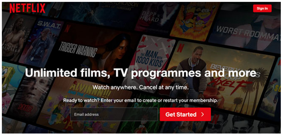
Netflix
| ✅ What works well | ⚠️ What could be improved |
| 1. Clear and bold value proposition. The headline “Unlimited films, TV programmes and more” is concise, appealing, and taps into abundance and variety—key emotional drivers. | 1. Slight visual overload in the background. For new visitors, this could create a subtle cognitive overload. A softened blur or more muted version might help bring sharper focus to the central copy and form. |
| 2. Minimalist design. There are no distractions, so the user’s focus is pulled toward the central message and action. | 2. Lack of social proof or trust signal. A subtle mention like “Trusted by 200M+ users worldwide” could further boost credibility—especially for users unfamiliar with Netflix (yes, they exist!). |
| 3. Trust and flexibility messaging. The subheadline “Watch anywhere. Cancel at any time.” reduces commitment anxiety by emphasizing freedom and flexibility. | 3. No mention of cost or trial. A brief line like “Start your 30-day free trial” would make an offer clearer and more reliable. As it stands, it assumes prior knowledge about how Netflix works. |
| 4. Efficient CTA The red “Get Started” button stands out visually and invites immediate action. |
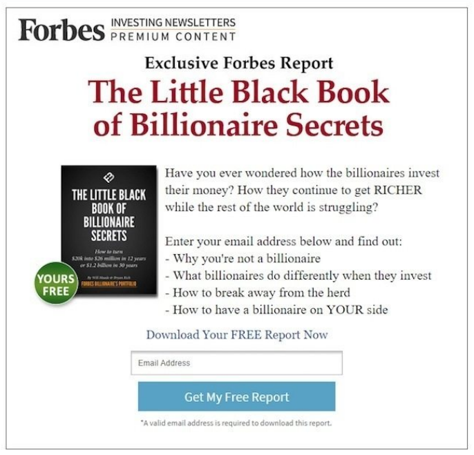
Forbes
| ✅ What works well | ⚠️ What could be improved |
| 1. Clear, compelling headline. “The Little Black Book of Billionaire Secrets” hints at exclusivity and insider knowledge—two powerful motivators. | 1. Overuse of capitalization. Phrases like “RICHER” and “YOUR side” in all caps can feel slightly aggressive or promotional. Lowercase or bold styling would retain emphasis while looking more trustworthy. |
| 2. Value-packed bullets. The bullet list clearly outlines what readers will learn. Each point taps into a psychological tension and positions the report as a solution. | 2. Layout feels dated. The overall visual structure leans toward an older, early-2010s design. Fonts, spacing, and button styling could be modernized for a more modern look. |
| 3. Visible free offer badge. The green “YOURS FREE” sticker on the ebook cover draws the eye and reinforces that the offer has zero cost. | 3. Slight redundancy in the CTA section. The phrase “Download Your FREE Report Now” is repeated close to the CTA button and could be made differently. |
To Sum Up
So what is a squeeze page? In this article, we showed that it has nothing to do with squeezing as much info into it as possible. Quite the opposite. The most efficient squeeze pages are the ones that have just the minimum of the right elements needed for a person to give away their email address.
A squeeze page is also a great example of how one of the simplest parts of your website can also be one of the most efficient ones. And when done right, it can convince a user to share their email address in a way that feels like a very valuable exchange.