- Home
- Science-Backed Marketing Insights
- The Psychology of Color in Ema ...

✨ Key takeaways:
⭐ Color effectiveness of the CTA button depends on contrast, context, and audience psychology.
⭐ Colors can influence decision-making by triggering emotional and physiological reactions.
⭐ The psychological impact of color is shaped by cultural context.
⭐ High contrast between the CTA button and its surrounding environment is more important than the specific color itself.
⭐ To select an effective CTA color, it is important to conduct A/B testing with real users.
Have you ever noticed that with some email buttons your hand is reaching out to click, while others feel totally blank? It’s not just the words you use or where the button is on the page. A surprisingly powerful factor is something we often overlook: color.
The psychology of color plays a pivotal role in shaping how people perceive and respond to visual cues. In marketing, this becomes especially critical when designing CTA buttons. Certain colors are wired to stir urgency, trust, excitement, or calm—each emotion influencing whether a user clicks or hesitates. These subtle signals impact attention and behavior at a neurological level—often before a person even consciously registers what they’re seeing.
In this article, we dive deep into the psychology of color and how it shapes decision-making. We’ll explore how the brain processes color, what different hues communicate in the context of marketing, and how marketers can leverage that knowledge to come up with the best colors for CTA buttons in their campaigns. With case studies, A/B test results, and neuroscience insights, we’ll learn how to pick up colors that lead to clicks.
The Science of Color Perception
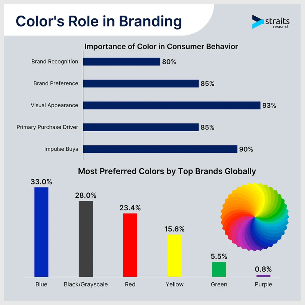
Our visual system and brain treat colors differently. The retina has three types of cone cells tuned to red, green, and blue wavelengths, and these inputs are converted in the visual cortex into the colors we perceive. What’s even more important is that some colors trigger strong physiological and emotional responses. For example, exposure to red has been shown to raise heart rate, blood pressure, and respiration—traits tied to arousal and urgency. By contrast, cool blue hues tend to lower heart rate and induce calm, creating a soothing effect. These built-in responses help explain why marketers often associate red with excitement or danger and blue with trust and security.
Meanwhile, the brain’s attention systems are tuned to “visual saliency”—we naturally fixate on the most contrasting element in a scene. Eye-tracking research confirms that a high-contrast button of any color will draw the eye first. This neurological basis—color signals + visual contrast—forms the foundation of how color guides decision-making: the brain uses color cues (and their brightness) to evaluate options quickly, even before the conscious mind registers the text. The psychology of colors in marketing is an important consideration, since a CTA button’s color can trigger gut-level reactions (excitement, calm, urgency) and capture attention via contrast, influencing whether users click or not.
CTA Colors: What Each Color Communicates
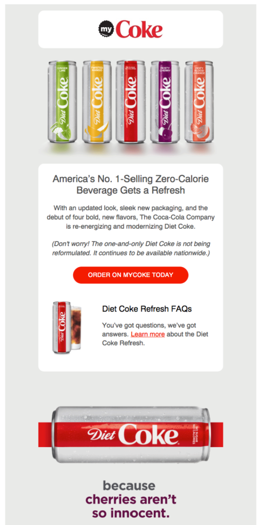
Red: Red is associated with urgency, energy, and alertness. It’s often used to “pull” users forward—think “Buy Now” or clearance banners. One of the most famous “red” examples of color psychology in marketing is Coca-Cola’s trademark red. In CTAs, red can create a powerful sense of immediacy. However, red also signals warnings and danger, so too much red can agitate or fatigue readers, and in some contexts it may trigger caution, like with “stop” signs.
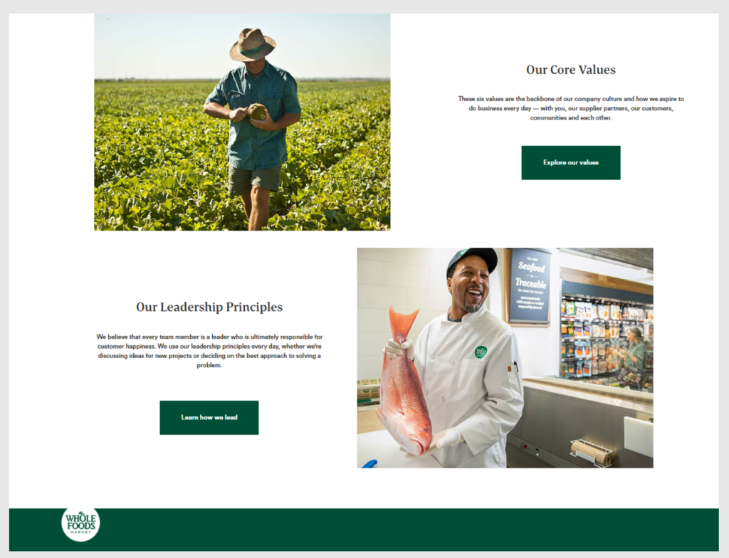
Green: It’s the color of “go” in traffic lights and is perceived as friendly and reassuring. Brands use green to suggest health, prosperity, or eco-friendliness. In CTA buttons, green often implies a positive action or “affirmative” step, while users tend to associate green with progress and tranquility, which can make green CTAs feel comfortable. On the contrary, because green is so common (and soothing), a green button must have enough contrast to stand out. If an email’s design already has a lot of green, the CTA may blend in.
Blue: Blue is often used by tech and financial brands (Facebook, Twitter, banks) to project reliability. A gentle blue or navy CTA radiates a feeling of stability and professionalism. Psychologists have found that blue environments can even enhance productivity and creativity. In marketing, this translates to confidence—a blue CTA can make a user feel assured about clicking. The downside: blue is one of the most popular colors, so on many sites, a blue button might blend into the general theme. For example, if an email has a white or blue background, a blue CTA might need a darker shade or outline to stand out.

Orange: Orange combines red’s energy with yellow’s warmth. It’s often associated with creativity, friendliness, and enthusiasm. Many conversion experts even nickname it “BOB” (Big Orange Button) to emphasize its visibility. The eye-catching quality of orange can boost action (it’s essentially a “fun” color that still stands out). However, avoid overusing it: too much orange can overwhelm (it’s “loud”), so reserve it for the main CTA only.
Yellow: Human eye can see yellow faster than other colors, which is why road signs and warning signals are yellow. In marketing, yellow often conveys happiness and urgency (think of the Golden Arches of McDonald’s—a yellow sign on a red background creates an energetic, child-friendly cue). At the same time, yellow can be jarring or seem childlike if overused. It works best for flash sales or playful brands. As one marketer notes, yellow grabs attention like a beacon, but it may be best for “cheap and attention-required” offers.

Additional colors: Don’t ignore neutrals. Black in a CTA can feel bold and sophisticated, especially with fashion or luxury brands. White (or very light) buttons can look clean and minimal on dark backgrounds, but they must have a colored border or text to stand out. Subtle shades like grey can feel muted or secondary—they often denote “cancel” or “skip” actions. And while we rarely use purple or pink for CTAs, they carry their own meanings (purple = luxury/creativity; pink = fun/romance).
Examples of Color Psychology in Marketing: Case Studies
Real-world tests confirm these principles. For example, an A/B test conducted by HubSpot on the color of CTA buttons proved that clicks can go up by 21% just from changing the green color of the button to red. Likewise, UX researchers Dmix reported a 34% lift when replacing green CTAs with red on one landing page. In both cases, the green buttons initially blended with the page, while red added just the right amount of contrast.
However, other analyses show the picture isn’t one-size-fits-all. A review by EyeQuant found that all colors can win, if used correctly. Their meta-analysis noted cases where orange, pink, bright green, even white CTAs outperformed red, which points to the fact: contrast and context matter more than hue alone. If a site’s palette is heavy on one color, a CTA in that same color will vanish, even if it is red.
Eye tracking research backs this up: users fixate on the highest-contrast elements first. In practice, experiments suggest that ensuring your CTA color pops (versus blending in) can boost sales by 35% or more. In short, one test might favor red while another favors blue, but all agree on the core point: the CTA must leap off the page.

This meme is a great representation of how our eye-tracking works. Most people will read the text in exactly the same order as the meme points, and only a few will deviate.
Cross-cultural note: The psychology of color also hugely depends on the cultural context. While Western audiences often see red as urgent or even aggressive, in some Asian cultures, red symbolizes luck and celebration. But surprisingly, research found Chinese consumers didn’t always respond better to red. Findings of this study prove that red does not sell equally well everywhere and that cultural context is not always the best predictor of CTA color choice.
Best Practices for Choosing CTA Button Colors
✅ Maximize contrast and visibility. When it comes to the CTA color, the most important rule is that your CTA must stand out. For that, choose a button color that contrasts sharply with the email’s background and surrounding elements. Luminance contrast for the CTA is equally important. Use tools or color-contrast checkers to ensure the button-to-background ratio meets WCAG standards—a set of internationally recognized standards to make digital content accessible for everyone.
✅ Match the tone and intent. Here it is important to make your colors work for you, not against you. What does that mean? For urgent, time-sensitive offers like sales and countdowns, warm colors like red or orange can amplify urgency. For financial, security-pledge, or sign-ups, cooler tones like blue and green are more appropriate, as they signal stability and safety. A bright red “Buy Now” feels different from a calming blue “Learn More.” So, alignment of the CTA color with the campaign’s emotion is crucial.
✅ Be consistent with branding—but test exceptions. Using your brand’s primary color for the CTA can strengthen its recognition. However, if your brand color blends into the layout, consider adding a contrasting accent. While brand palette is important, the button color should first serve its primary function, which is attention grabbing. In practice, many marketers will override the main brand hue if it improves contrast. For example, if your site is mostly green, a green CTA may not pop, and in this case it might be worth testing a complementary color instead.
✅ Follow accessibility guidelines. Ensure your CTA color choice works for all users. For that, follow WCAG guidelines advising a contrast ratio between the foreground color (text) and the background color of at least 4.5:1 with its background. Also, don’t rely on color alone to convey meaning—always include clear text. WCAG explicitly warns against using color as the only visual cue. This means an icon or underline can help anyone who can’t perceive your chosen hue.
✅ Test and personalize. Even with these rules, the only way to know your best CTA color is to test it with your audience. Conduct A/B tests changing only the button color and measure clicks. Every audience is different: the color that converts 30% more in one industry might fail in another. Also consider segmenting by region or persona: a color that works wonders in one culture may underperform in another. Analyze your results and iterate—data-driven testing is the most certain path to the optimal CTA color.
CTA Color Pitfalls to Avoid
⚠️ Overusing bright, aggressive colors. A neon, flashing-color approach can cause an effect known as banner blindness or cause visual fatigue. If every element looks like it is screaming for attention, nothing stands out. That’s why it is important to use bright colors cautiously for true CTAs, not for every headline.
⚠️ Relying solely on color to indicate importance. Don’t make your CTA’s function dependent on color alone. It means avoiding marking “important” links only by making them red or highlighted; always use text, icons, or size for additional clarification. In practice, also using clear button text like “Download Now” or “Yes, Sign Me Up” makes sure that all users understand the action, regardless of how they perceive the color.
⚠️ Mixing too many CTA colors. An email should have one clear primary action. Using multiple bright CTA colors creates confusion about hierarchy. It dilutes each button’s visual weight. The golden rule here is to stick to one main CTA color per email (plus a distinct but subtler secondary color if absolutely needed).
The Best CTA Button Color
There is no universal “best” color, as it depends on multiple factors and might sometimes contradict your brand tone and voice. Here, we’ve prepared a short guide that can be used as a reference at times when color choice gets really hard:
🔹 Contrast & visibility: Does the button color sharply contrast with the surrounding design? (Use WCAG contrast guidelines.)
🔹 Emotional fit: Does the color evoke the intended emotion or action? (Red for urgency, green for reassurance, blue for trust, etc.)
🔹 Standout factor: Is the color different from your page’s dominant hues? A color that isn’t already used elsewhere will naturally pop.
🔹 Tested performance: Have you A/B tested alternative colors? Use data to confirm that your chosen color actually improves clicks on your audience.
🔹 Accessibility: Is the color scheme accessible? Check the contrast ratio (≥4.5:1) and avoid problematic combinations like red/green for colorblind readers.
🔹 Clarity: Does it stand out from other elements (size, text, spacing)? Even the best color can fail if the button is too small or unreadable.
To Sum Up
The psychology of color in email CTAs combines how we physically perceive color with the learned associations each hue carries. Marketers increasingly rely on color meanings in marketing to nudge user behavior.
But while science gives us patterns, it’s important to remember that color psychology isn’t a constant. The way our brains interpret color is not just neurological; it’s also deeply contextual and cultural. The same shade that sparks action in one country may create hesitation in another. The best CTA button colors aren’t universal—they are influenced by everything from campaign goals and brand tone to background contrast and user expectations.
This is precisely what makes the psychology of color in marketing so fascinating. It invites us to think beyond trends or “magic colors” and instead build smarter, more competitive campaigns—grounded in science but sharpened through thoughtful design and constant testing.