- Home
- Friday Column
- Call to Action (CTA) Examples ...
There’s no doubt that every element of your email marketing campaign matters. Nonetheless, it is when a user presses a CTA button that curiosity turns into action and an email becomes a powerful tool that drives actual results.
So, what is a good call to action? What creates this urge to press the button and know more about an offer or get deeper into tips outlined in a newsletter? The thing is, there’s no one answer to this question, as an effective CTA is always about the right blend of design, placement, personalization, and even the size.
If it sounds like too much effort to put into such a small button—think about the fact that a visually appealing design of your CTA can boost your click-through rates by up to 42%. Want to take it to the next level? Personalize your CTA. Research suggests personalized calls to action perform an incredible 202% better than their basic counterparts.
But here’s where it gets really interesting. The number of CTAs in your email can make or break your campaign. While 30% of marketers decide for two CTAs per email, 43% opt for one. Turns out the latter get it right, and the real magic happens when you simplify. Turns out that reducing the number of CTAs to just one can skyrocket your conversion rates by an unbelievable 266%. In the end, it all boils down to cutting through the noise and guiding your reader toward a single, clear action.
In this article, we decided to dive into CTA examples and explore some creative call-to-action ideas that will inspire you to rethink your email strategies. We’ll uncover what makes a good call to action and reveal the small changes that can lead to big wins.
Real-Life CTA Examples
Promotional CTA examples: A perfectly balanced campaign from Olipop
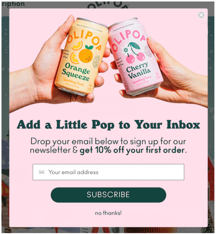
This campaign from Olipop looks perfectly balanced: it is vibrant and visually appealing while at the same time it does not overwhelm you with too many design elements or content.
While the CTA button is just a traditional “Subscribe,” it fits perfectly to this particular offer, which is to encourage users to sign up for Olipop’s newsletter in exchange for a 10% discount on their first order. This immediate benefit serves as a strong motivator, especially for first-time buyers, and makes the CTA highly effective.
The overall color scheme, with soft pink and orange colors, is bright and summary, which makes a contrasting dark green CTA button, centered and placed at the bottom, stand out in a visually appealing way.
The copy is overall rather minimalistic, but still very playful and aligned with the brand’s voice. “Add a Little Pop to Your Inbox” cleverly tying the brand name (Olipop) into the action of subscribing, which makes the email feel more personal. Like this, pressing the “Subscribe” CTA button feels natural and not like a hard sell.
Alternative CTAs for promotional campaigns:
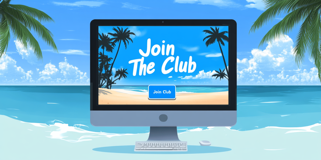
- Join the Club!
- Sign Me Up!
- Dive In!
- Stay in the Loop!
- Join the Adventure!
Newsletter CTA examples: For all the best pet parents out there
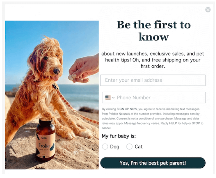
This campaign is a charming and effective example of how to engage pet owners with a CTA that is both personal and rewarding. The email invites users to “be the first to know” about the company news with the added incentive of free shipping on their first order. The example of the CTA button here feels honest and emotional and makes the action of signing up feel like a natural extension of the reader’s love for their pet.
Visually, the campaign is warm and inviting; it immediately grabs attention and creates a connection with pet owners. At the same time, by framing the CTA as a confirmation of the reader’s role as a “pet parent,” the campaign adds an emotional layer that enhances its effectiveness. The overall approach here feels personal, inviting, and perfectly tailored to the audience, making the CTA sound like a proof of their dedication to their furry family member.
Alternative CTAs for newsletters:
- Count Me In for the Best!
- Yes, I Deserve This!
- I Want to Level Up!
- I’m Here for the Experience!
- Ready for Success!
Re-engagement CTA examples: Remind about your products in style
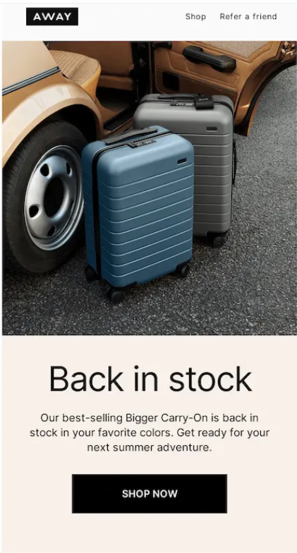
This campaign is clearly focused on one thing: to inform customers that a popular product is back in stock and ready for purchase.
Visually, the email is minimalist, with the focus on the product image. The use of neutral tones helps to place the focus on the key elements—the product and the CTA. The “Shop Now” CTA button is a classic. It is positioned at the very bottom of the email, finalizing a smooth transition from a visual to a short description and to action. It also contrasts against the light background, which makes it stand out and grabs the reader’s attention right away.
Overall, this campaign uses a no-nonsense approach: there’s no extra elements, but all those that are there are well aligned and serve the same purpose. It has a clear, direct message, an eye-catching CTA, and a clean, product-focused design. The combination of simplicity, style, and contrasting colors allows it to grab attention and convert it into action.
Alternative re-engagement CTA examples:
- Claim Your Deal!
- Get It Before It’s Gone!
- Rediscover What You Love!
- Take Another Look!
- Dive Back In!
Event-related CTA examples: Let us party like in 1959
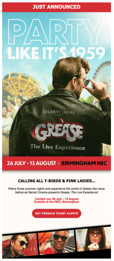
In this campaign, Secret Cinema decided to go nostalgic full speed ahead. Visually, the campaign leverages the iconic Grease aesthetic, with a color palette and typography that echo the 1950s vibe.
While the spirit of the classic Grease movie sets the retro tone, vivid red colors take your back to the era’s bold design elements and highlight some key elements like CTA and the dates.
The CTA—“Get Presale Ticket Alerts”—is strategically placed at the bottom to fuel up the reader’s excitement. By combining the CTA message with the red color, marketers managed to fuel up the fear of missing out (FOMO) on this limited-time event. The red button stands out against the background, going together with the bold style of the campaign and making sure the reader’s attention is drawn straight to it.
Alternative event-related CTA examples:
- Reserve Your Spot!
- Grab Your Ticket!
- Be There!
- Sign Up for the Event!
- Join Us Live!
Abandoned cart CTA examples: Don’t make Ray Ban angry and finish your purchase
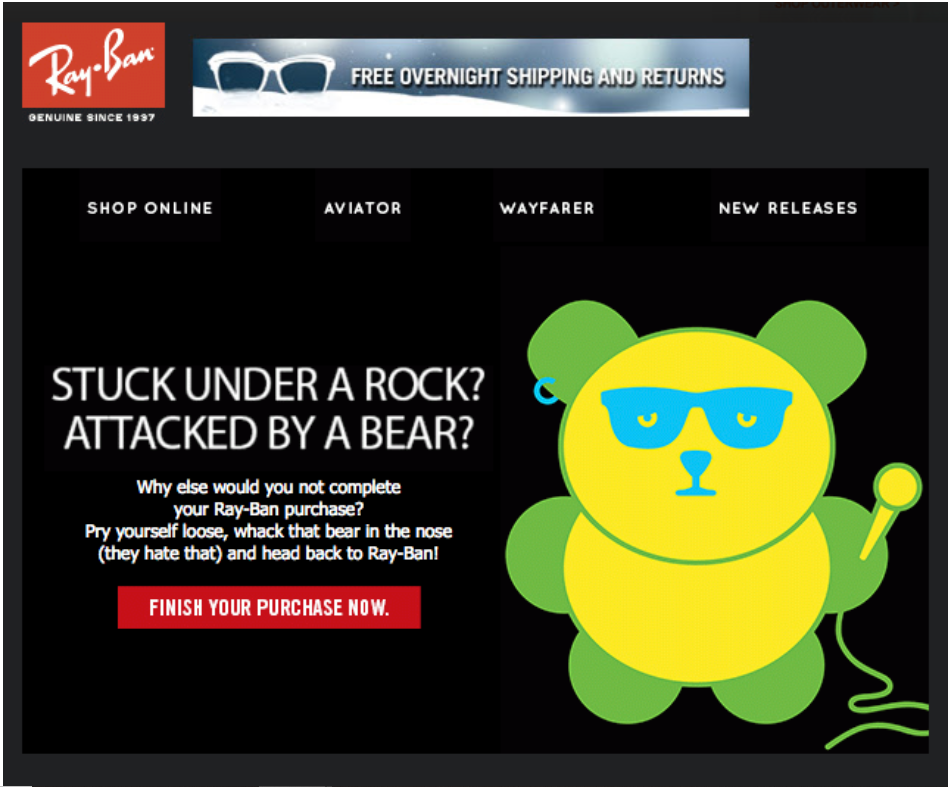
We love this “angry” Ray Ban campaign! In this campaign, the company decided to take a bold and humorous approach towards customers’ abandoned carts and aligned the CTA with an overall vibe.
“Stuck under a rock? Attacked by a bear?”—in the end, what other reason might there be for not finishing your purchase? This absurdly funny punchline of the campaign leads you straight to the bright CTA.
Here the “Finish Your Purchase Now” CTA, while being traditional, is perceived as a humorous push, following the overall quirky tone of the email. The bright red button is another great design element—it contrasts sharply against the dark background, ensuring it stands out and is easy to click.
Altogether, the combination of simple graphics matched up with bold design, fun content, and bright CTA does the job and really feels like buying that pair of glasses you left in your cart. By clicking on this red calling CTA!
Alternative abandoned cart CTA examples:
- Complete Your Purchase!
- Grab It Before It’s Gone!
- Finish What You Started!
- Claim Your Items Now!
- Ready to Checkout?
Seasonal/Holiday CTA examples: Steal the show. Literally
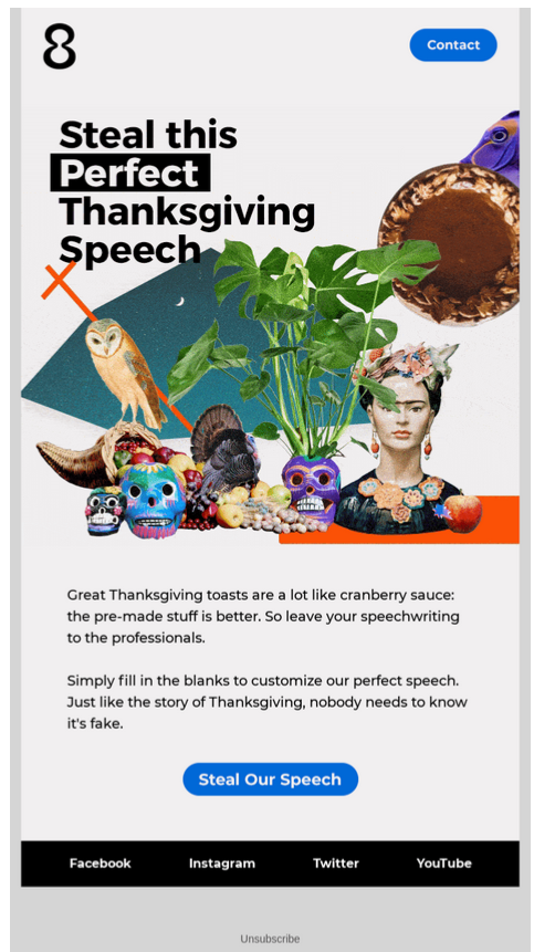
This campaign does not take itself seriously and offers us to do the same. It addresses many people’s pain point—giving a speech at Thanksgiving dinner—in a humorous and creative way.
The CTA—“Steal Our Speech”—is a brilliant play on the headline. It reinforces the playful nature of the campaign by offering to commit an act of downloading. Sorry, stealing!
This CTA makes the action feel like part of the joke. The blue button stands out against the surrounding elements, ensuring it catches the reader’s eye while maintaining the email’s quirky aesthetic.
Altogether, the collage-styled campaign looks unique and intriguing, drawing the reader in and setting the tone for the rest of the email. This visual creativity is mirrored in the CTA, which doesn’t just ask the reader to click—it invites them to join in on the fun. The entire email feels cohesive, with the imagery, copy, and CTA all working together to deliver a message that is both humorous and effective.
Alternative Seasonal/Holiday CTA examples:
- Celebrate in Style!
- Own the Party!
- Add Some Cheer to Your Cart!
- Let’s Make Some Merry!
- Gift Like a Pro!
3 CTA Mistakes That Will Kill Your Email Campaign
Weak words, weak results:
What does not go well with a CTA is weak and uninspiring language. We are all too familiar with the “click here” and “submit” buttons. So well, that usually do not want to perform neither of those actions. They are too generic, too vague, and too uninspired. They also lack a sense of purpose and motivation, preventing users from performing the desired clicking action.
So avoid generic words for your CTA as a plague. Instead, use strong, action-oriented language that clearly outlines the benefit or result of clicking. For example, phrases like “Get Your Discount Now” or “Claim Your Offer” not only tell the user what to do but also highlight the immediate reward. Altogether, boldness and creativity go with CTAs better than boredom and lack of inspiration.
Too many choices, no action:
Another critical mistake is overwhelming the reader with too many CTAs within a single email. When users are presented with multiple options, they can become paralyzed by indecision, leading to inaction—a phenomenon often referred to as “choice paralysis.” In email marketing, simplicity is key. A focused, single CTA ensures that the reader knows exactly what action to take without distraction. If you need to include multiple links, ensure that they all point toward the same goal or action. By narrowing the choices, you guide the reader more effectively towards the desired outcome, which increases the likelihood of conversion.
Hide the button, lose the click:
A mistake of placing the CTA in a location that’s hard to find or blending it into the design too much can be truly fatal for your campaign. The whole essence of CTA is that it needs to be immediately visible. You can achieve that by placing it above the fold, using contrasting colors, and ensuring it’s large enough to be easily clickable. If readers have to search for the CTA with a magnifying glass, most likely they won’t. The result: the effectiveness of your email campaign will be significantly reduced or even nonexistent.
To Sum Up
In this article, we looked into a variety of CTA examples—from traditional to very particular ones. While the right CTA can make your campaign stand out, it is important to align it with the overall design and copy of your campaign. So, when thinking about a good call to action, you might need to think broader and ask yourself, “How can I make an overall good and distinctive campaign?”
If all your elements are aligned, then your CTA should mirror the great design, nostalgic vibe, or boldness of the rest of your offer. It should feel like a natural extension of the message you’re communicating to your audience rather than an afterthought. While designing a campaign like this does require some effort, the outcome might be not just a mere click but a meaningful connection with your brand.