- Home
- Science-Backed Marketing Insights
- Too Many Options, Too Little T ...

Today we have choices—lots of them and in every life aspect. They are offered to us from TV screens, at shop counters, on billboards, and in online ads. Practically every outlet offers us plenty of everything. Our inboxes are not an exception: they have become a marketplace, a newsroom, and a billboard all at once. Every morning, consumers open their emails to find a stream of product launches, discount offers, content updates, and reminders—each and every one of them demanding choice and attention.
What might seem like abundance at first often produces a very different effect: hesitation, stress, and, ultimately, inaction. Scholars have long noted this paradox of choice: people presented with too many options are significantly less likely to make a choice than those presented with just a few. In psychology this dynamic is described as choice overload; in consumer behavior, it is closely tied to the rise of consumer anxiety.
Implications for marketers? Every email you send adds to a subscriber’s daily toll of micro-decisions. Should they click “Shop All” or “Read More”? Should they compare products now, later, or not at all? Research from Baumeister and colleagues (1998) called this decision fatigue—the gradual erosion of decision-making ability as the day goes on. This is not the same as the engineered urgency of FOMO, where scarcity and time pressure push people toward action. The anxiety here emerges from the opposite condition: too many possibilities, presented without enough structure. If fear of missing out creates adrenaline, choice overload creates paralysis.
In this article, we will examine how email campaigns can unintentionally trigger this paralysis, drawing on cognitive psychology and cognitive load theory in email design. We will also explore practical strategies to counteract it, from designing emails that reduce decision anxiety to adopting the best email layouts for reducing cognitive strain.
The Science of Decision Fatigue and Choice Overload
Choice, in theory, should empower. The more options we have, the closer we come to finding something that perfectly matches our preferences. Yet psychology tells a different story: when confronted with too many possibilities, people hesitate, second-guess, or walk away entirely. This is the essence of choice overload in marketing—the phenomenon where an excess of options reduces the likelihood of making any choice.
The most famous demonstration comes from Iyengar and Lepper’s jam study. In their experiment, shoppers were presented with two displays: one featuring 24 different jam flavors, the other just six. While the larger display attracted more passersby, only 3% made an actual purchase. By contrast, nearly 30% of those who saw the smaller display bought jam. In other words, abundance drew attention, but simplicity drove action. This is sometimes called the too-many-choices or overchoice effect, and its lesson for marketers is straightforward: more is not always better.
A related but distinct concept is decision fatigue. Roy Baumeister and colleagues (1998) showed that people have a finite amount of mental energy for making decisions. Each choice—from trivial (Which shirt should I wear?) to significant (Should I buy this car?)—draws from the same limited reservoir of self-control. Over time, this leads to ego depletion: later decisions are more impulsive, of lower quality, or avoided altogether. For email marketing, this has clear implications. If a subscriber has already spent their morning making dozens of work and life choices, encountering a confusing message in the afternoon can tip them into email marketing decision fatigue territory, where the easiest path is to close the email rather than decide.
Science makes clear that our brains are not wired for endless comparisons. The practical question becomes: how can email campaigns respect these cognitive limits instead of exploiting them?

How Email Campaigns Can Accidentally Create Anxiety
⚠️ Too many CTAs, too little clarity
Sending an email campaign with multiple CTAs can seem like a good idea. On the one hand, it’s convenient: you give recipients the ability to compare plans, start a trial, or “shop all” in one place. It’s like a one-stop shop, offering multiple paths for different types of consumers. And sometimes it works. But just as often, it produces hesitation. The recipient has to pause and weigh which action makes the most sense—and often decides on none. Psychologists call this analysis paralysis, the friction that arises when too many equally weighted options compete for attention. In email, that friction often ends with the user closing the message without clicking anything at all.
⚠️ Product grids that feel like mazes
A similar problem comes from complex product grids or option-heavy layouts. Marketers are tempted to stuff an email with rows of thumbnails, each tagged with a discount, a deadline, and a call to action. The idea is simple: if the subscriber doesn’t like one offer, maybe they’ll like another. But instead of nudging them toward a purchase, this visual overload—often squeezed into a five-inch phone screen—has the opposite effect. People get overwhelmed by the sheer diversity of options and withdraw from any decision. Research into how choice overload affects email performance confirms that when consumers must process large assortments quickly, both satisfaction and conversion decline.
⚠️ When content becomes cognitive load
Another misstep is content density. From a cognitive perspective, every additional block of text is another demand on working memory. So, when emails contain long descriptions, multiple subsections, and dense paragraphs, subscribers may skim the first few lines and abandon the rest. Cognitive load theory in email design suggests that once material exceeds working memory capacity, comprehension drops sharply.
⚠️ Urgency without relief
Finally, there’s the pressure loop created by repetitive campaigns. When every email shouts, “Don’t wait—choose your plan now!” yet each presents the same undifferentiated set of options, it presses down on the reader rather than clarifies. Instead of creating momentum, the repetition amplifies indecision. The tone of urgency—that is so effective in FOMO marketing—when paired with a clear path, backfires when layered on top of unresolved choices. The result isn’t action but avoidance: deletions, disengagement, or unsubscribes.
Recognizing the Signs: When Your Email Causes Friction
👉 Opens without clicks
When your readers open emails but do not engage any further, it is an early warning sign. It means that your subject line might hook them up and spark curiosity, but when they open, something prevents them from engaging. And that something can be multiple CTAs, very long paragraphs, or overly dense text. Many readers are just too tired to engage with so many signals, so they simply close the email without doing anything.
👉 Unsubscribes and drop-offs
Another red flag that you should pay attention to is a spike in unsubscribes and disengagement, especially after multi-offer emails. When readers feel pressured to choose from too many options all at once, the easier choice is sometimes to opt out entirely. In the context of email marketing decision fatigue, unsubscribes often reflect not rejection of the brand itself, but more like saying, “Hey, I see you, but can you please slow down? I don’t have it in me to choose so often.”
👉 Scroll fatigue
Experts also point to scroll fatigue as another factor that prevents people from engaging with emails. If attention plummets halfway through a copy, it suggests the layout demands more cognitive effort than the audience is willing to spend. In other words, people stop scrolling because they’re already mentally done. And that’s another sign to reconsider your copy—maybe make it a little less dense, remove some text, or cut down on CTAs.
👉 Tools to diagnose
To catch these issues early, it helps to use analytics tools that show how people actually interact with your emails. A heat map (often a part of advanced ESP), for example, can reveal which parts of your email people click the most. A scroll map shows how far down readers make it before they stop. CTA tracking highlights which buttons get attention and which ones are ignored. Together, these tools give you a clear picture of where readers lose interest and where problems and, ultimately, consumer anxiety are creeping into your campaigns.
Tactics to Reduce Consumer Anxiety in Email Design
💎 Limit the number of choices
If you want to address consumer anxiety, the simplest way to do it is just to reduce the number of decisions you ask your readers to make. So, try to focus each email on one goal, or one product, or one idea. This way, you already strengthen your customer’s focus. If you include several options, make sure that there is still one CTA that clearly stands out.
If you follow these simple rules, your readers won’t need to guess or think too much, because the next obvious step will be right in front of them. Research into choice overload in marketing confirms that fewer, more focused options almost always lead to more decisive action.
💎 Use visual hierarchy to guide decision flow
Design plays a very big role in reducing indecisiveness. So, always give your emails a clear visual hierarchy. Include headlines, value, and a CTA. This way, you make the desired action obvious and remove this pressure of searching for meaning and the right button from the reader. Don’t consider whitespace as a waste of space. It’s a sort of breathing room that guides the user’s eyes and lowers the cognitive strain. So, by using bold text, minimal distraction, and a layout that guides users naturally, you help readers act without too much effort.
💎 Provide context or pre-filtered choices
Sometimes choice is necessary, and what helps to make it easier is creating context. So, instead of just adding more generalizations like “Shop All,” try something like “See the three best picks for you.” Guide users with top recommendations or personalized suggestions: they help the reader feel guided rather than dumped into an endless catalog of options. This way, you are designing emails that reduce decision anxiety.
💎 Use reassuring copy to lower pressure
Language plays a big role in how people experience your emails. If you try to apply pressure in every second line, readers might choose to close the email as the easiest way out. By adding phrases like “No rush,” “You can always change later,” or “We’ll help you decide,” you tell the subscriber that they are in control and that the choice is not final or risky. This kind of copy also helps to counteract analysis paralysis because it gives clear, low-pressure next steps.
💎 Consider progressive disclosure
If you design your email in the right way (see the points above), your readers will get the information progressively, which is easier to digest and act upon. Presenting everything upfront can overwhelm readers and trigger decision fatigue. Progressive disclosure, on the other hand, is a way to reveal details step by step. It can be done either across several emails or between the email and the landing page. This way, you don’t overwhelm your readers and show them that they control the pace.
Learn from the Best: Real-Life Cases
✅ Brands that do it well
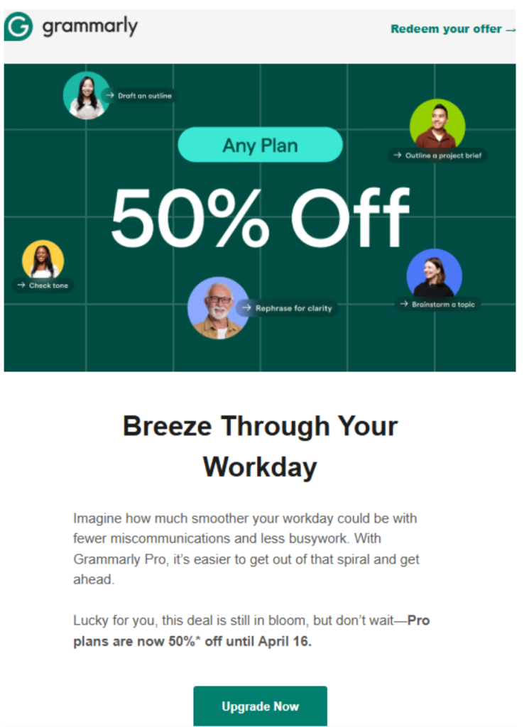
1. Grammarly
The writing assistant Grammarly sends weekly usage summary emails with a single clear CTA. They might send an email that shows “Your Weekly Writing Stats” with one prominent button saying “See Your Performance.” Upgrade promotion emails similarly hone in on one benefit of going premium and a single “Upgrade Now” CTA.
📌 Why it works: Grammarly’s emails are minimalist in both layout and purpose. Each message has one goal (it can be sharing insights or offering premium). The design uses plenty of whitespace, a few key metrics or points, and one big button. They do not crowd the email with multiple offers, like secondary ads for other products, or an “also check out” section. They make their email light and breezy, and users feel the same when reading them. With just a few simple tricks, the company manages to deliver their message without overwhelming their recipients.
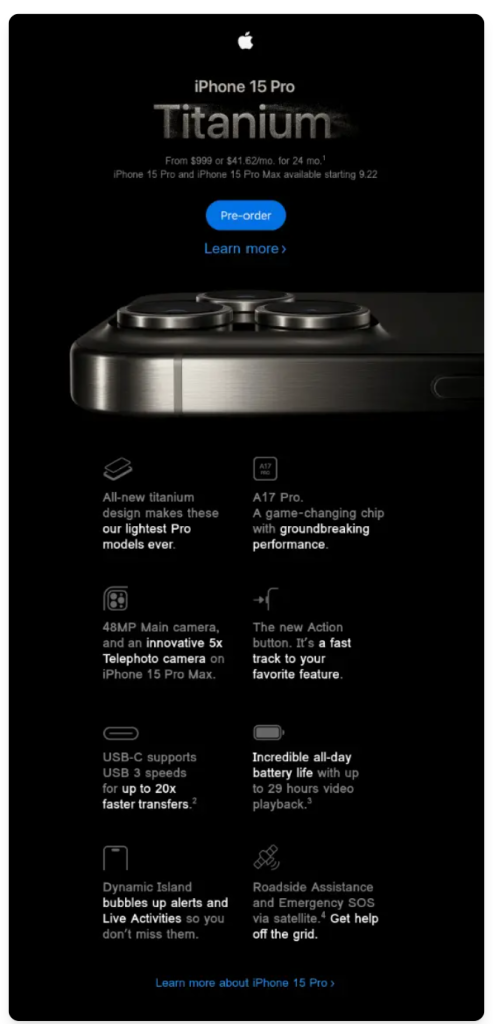
2. Apple
Apple’s product launch emails are a gold standard for avoiding choice overload. When Apple announces a new iPhone or Mac, the email typically spotlights one product, with a hero image, a concise tagline, and a single primary CTA (such as “Pre-order now”). The copy is extremely short—often one sentence highlighting a key feature or value—and there may be a secondary link for those who want to “learn more,” but the overall presentation is one big invitation to focus on this product.
📌 Why it works: Apple’s emails are the epitome of simplicity and visual hierarchy. Apple doesn’t try to sell you five things at once. Even when Apple has an email that mentions multiple devices (say during a holiday campaign), they give each its own section or, more commonly, send separate emails for each product line. The result is an email that feels elegant and easy to engage with—there’s no effort required to figure out what Apple wants you to do. (It’s no surprise their emails have high conversion, as they remove the question “Where should I click?” entirely.)
❌ Brands That Overdo It
1. Daily deal emails from Groupon
Subscribers to daily deal services often receive emails from different brands that look like a long list of promotions. A single Groupon email might include “Today’s Top Deals” across 10–15 categories—restaurant vouchers, spa discounts, product flash sales, travel packages, etc. Each deal is accompanied by a small image and its own CTA.
📌 Why it doesn’t work: There’s so much sensory input and so many different options that it’s hard for a recipient to find anything relevant, let alone decide on it. It’s the email equivalent of a chaotic bazaar. Users might engage initially (because who doesn’t want to browse deals?), but scroll fatigue will ultimately set in. Many will skim a few items, feel overwhelmed or uninterested in the rest, and abandon the email. Moreover, emails with dozens of different deals and just as many CTAs can train people to ignore content.

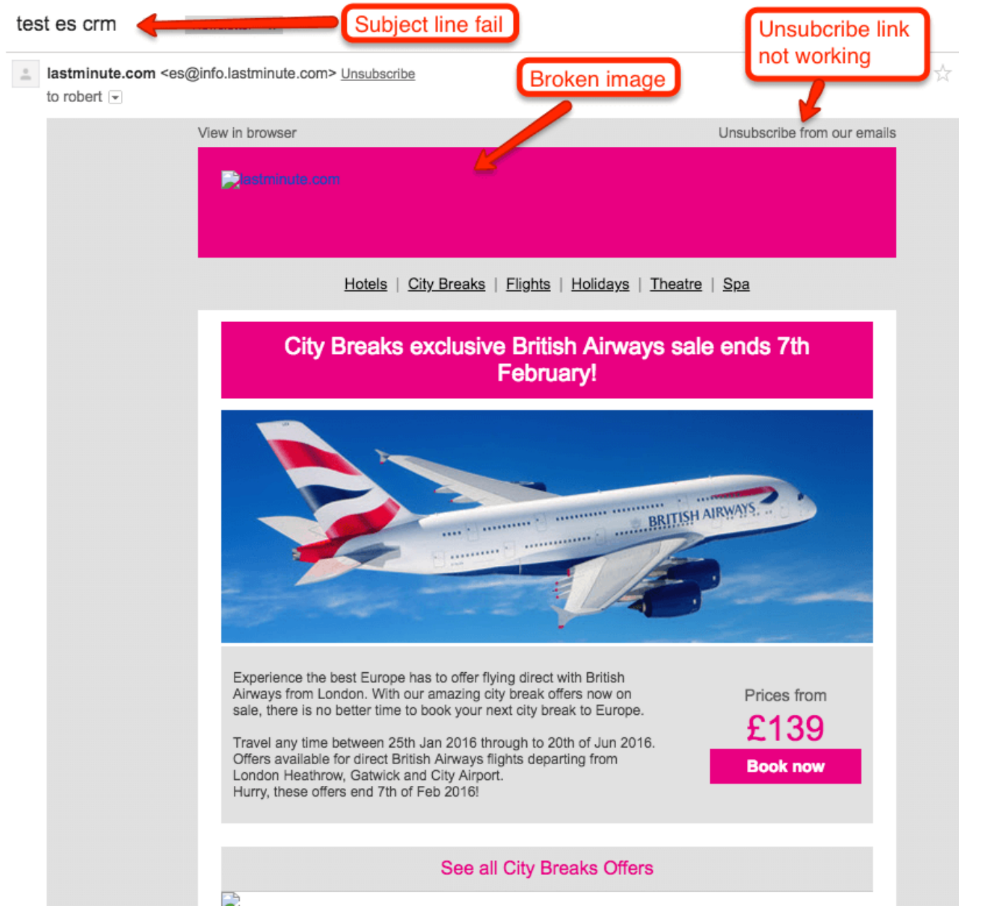
2. British Airways
Airlines often try to promote their deals accompanied by hotels, car rentals, restaurants, and other activities that people might enjoy doing on vacation. Nonetheless, many of them tend to overstuff their emails so that the main offer seems lost while users remain confused about where exactly they should click. If multiple deals are accompanied by their own CTAs, that makes the whole offer look even more confusing.
📌 Why it doesn’t work: While there is only one main CTA in this British Airways offer, there are multiple additional categories, such as city breaks and holidays (sounds complex), flights (other flights), theaters, and SPAs. On top of that, it apparently is not very well optimized for different email providers because some of the images appear to be broken, while the subject line looks confusing and might even make users suspect spam. Finally, the copy written in a very fine font is hard to comprehend, which may make the whole deal misleading.
To Sum Up
Consumer anxiety in email campaigns is actually very far from real anxiety—but it still can severely harm your business. And if that’s not a thing to be phobic about, we don’t know what is. We live in the day and age of plenty—there is no shortage of offers and alternatives. While this sounds like a great thing, it’s not necessarily so: the fear of missing out is always present, as well as dozens of micro-decisions we need to make every day. Should I keep reading? What’s on Netflix right now? Did I just get a notification?
Understanding how many things your customers need to deal with on a daily basis might help you improve your email marketing campaigns—by removing excessive load from your emails, you are sparing your customers from an additional portion of consumer anxiety in their inboxes. Because, trust us, they already have enough of it elsewhere.