- Home
- Friday Column
- Top 10 Email Marketing Campaig ...

The world of digital marketing evolves constantly. Nonetheless, what remains a cornerstone of digital communication is email campaigns. What makes marketing emails so effective for customers also makes them challenging for marketers. Crafting the best email marketing campaigns requires a deep understanding of emerging trends, demographic nuances, and creative execution that can make each email feel personalized and relevant. In a landscape where consumers are constantly bombarded with information, the ability to capture attention and provoke engagement through a simple email requires both knowledge and creativity.
In this article, we explore different email marketing campaign examples—from promotional offers to newsletters—and analyze what makes each of them efficient. By examining these strategies, we aim to provide useful tips that can help marketers reach their audience and turn passive readers into active participants in their brand’s journey.
Tripadvisor
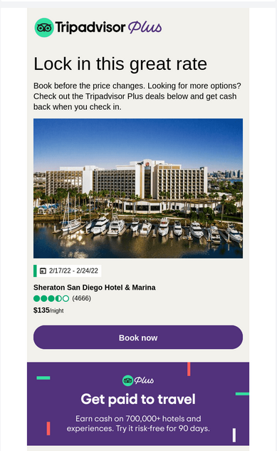 | 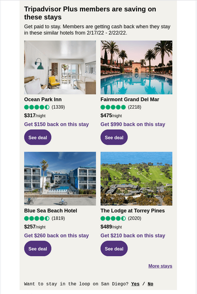 |
Campaign type: Promotional offer for long-term members.
Campaign goal: The primary goal of this campaign is to increase bookings by promoting special rates and cashback opportunities to Tripadvisor Plus members. A secondary goal is to enhance customer retention by reinforcing the benefits of the Tripadvisor Plus membership.
Why is it effective?
This email marketing campaign combines an eye-catching design with effectiveness. On the one hand, it focuses on visual appeal with high-quality images of the hotels and destinations while at the same time presenting its offers in a clear and well-organized manner.
The campaign is written in an engaging way and effectively communicates the urgency (“Lock in this great rate,” “Book before the price changes”) and exclusivity of the deals (“Tripadvisor Plus deals”).
To simplify the decision-making process for the reader and increase the likelihood of conversion, the campaign offers to “See deal” after each offer and to “Book now” as the primary CTA.
While not explicitly personalized to the individual, Tripadvisor’s campaign focuses on its Plus members. It almost screams that being a Tripadvisor’s Plus member is not just a matter of status—it is primarily about your interests and savings.
Campaign bonus: Ending the email with a question about staying in the loop on San Diego suggests an interest in the recipient’s preferences.
Check out the key principles of hotel email marketing here: Email Marketing for Hotels: Key Strategies in 2024
Hulu
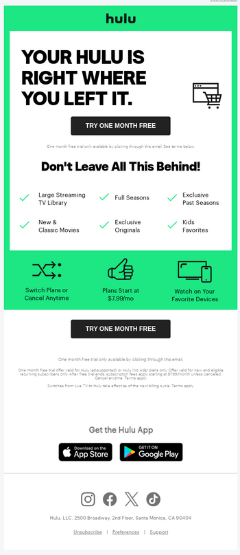
Campaign type: Reactivation campaign.
Campaign goal: To increase re-engagement among users who have not recently interacted with the service.
Why is it effective?
In this re-engagement email marketing campaign, Hulu uses a free trial as an incentive to regain users who might be hesitant to return to a paid subscription.
“YOUR HULU IS RIGHT WHERE YOU LEFT IT” is a simple yet smart headline that evokes a sense of continuity and personal connection to the service. Whatever users enjoyed before is still available and waiting for them; all that is needed is to click on either of the two CTAs prominently displayed at the top and bottom of the email.
Packed in Hulu’s distinctive green color palette, this email campaign is both eye-catching and immediately identifiable with the brand. Combined with a straightforward layout, it clearly explains why, with Hulu, your leisure time is better than without it.
DeFeet
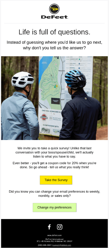
Campaign type: Engagement survey.
Campaign goal: To engage customers and collect valuable feedback that can guide the company’s future products or services.
Why is it effective?
This survey email campaign from DeFeet engages its target audience by incorporating humor and addressing the struggles of fellow cyclists (aka their customers). A lifelike image plus a fun copy makes this campaign very relatable, puts a smile on your face, and makes you actually want to press the “Take the Survey” button.
Here, DeFeet uses a very direct, fun, and human approach to engage customers by emphasizing the value of their input compared to ordinary conversations with a boss or spouse. Plus, the inclusion of a 20% coupon for participation works as an additional incentive.
Campaign bonus: The option to change email preferences at the end shows respect for customers’ preferences and further promotes a positive user experience.
Three Spirit
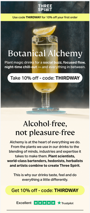 | 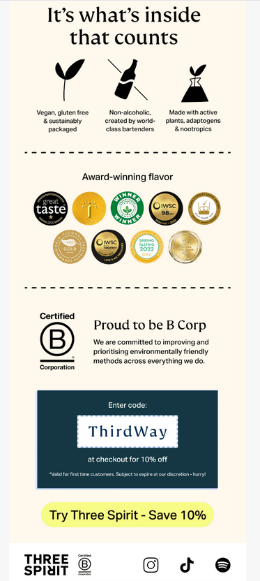 |
Campaign type: Promotional offer for first-time buyers.
Campaign goal: Encouraging first-time purchases with a promotional discount and increasing brand awareness by emphasizing the unique qualities and ethical commitments of the brand.
Why is it effective?
Let’s start with the design: This is one of the email marketing campaign examples that skillfully combines beautiful visuals with brief but informative descriptions.
By targeting consumers interested in wellness and social enjoyment without alcohol, it provides an inspiring description of a healthy drink fitting for multiple occasions.
The campaign targets an audience interested in health and wellness but uses language that makes it sound not boring but rather cool and fancy. CTAs with a 10% discount offer are blended into the text while standing out with contrasting designs, making them visible but not too invasive. By educating its audience while offering a financial incentive, the campaign sparks interest on two levels.
Campaign bonus: Highlighting certifications such as B Corp and awards supports the brand’s commitment to sustainability, further appealing to the target market’s values.
OpenTable
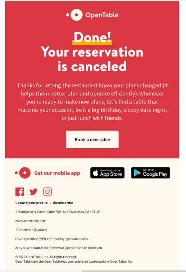
Campaign type: Transactional email.
Campaign goal: To confirm the action taken by the user (cancellation of a reservation) and to maintain customer engagement by encouraging them to book another table in the future.
Why is it effective?
The effectiveness of this email lies in a combination of a bold, straightforward message and an eye-catching color scheme. The bold “Done! Your reservation is canceled” headline clearly communicates the purpose of the email. Similarly, a bright color scheme helps keep the tone of the email upbeat, mitigating any negative feelings associated with canceling plans.
Despite being just a cancellation confirmation, this email campaign still thanks the user for notifying the restaurant of the change in plans and provides a gentle nudge to re-engage with the service for other occasions.
Finally, the CTA, strategically placed after a message, makes it easier for users to make new plans or reschedule their reservations right away.
Away
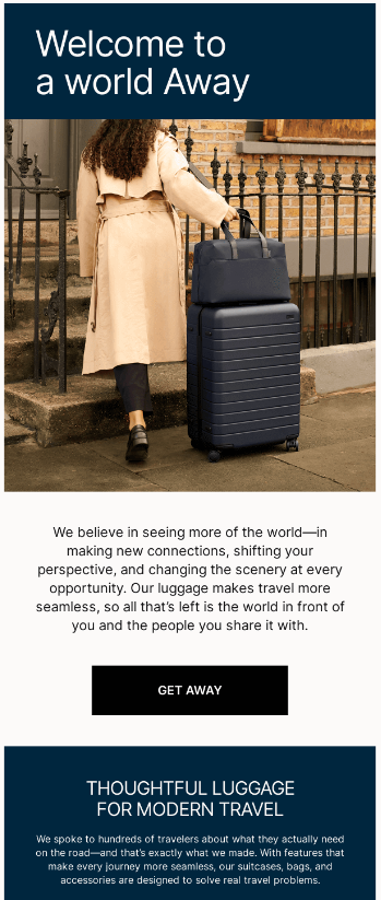 | 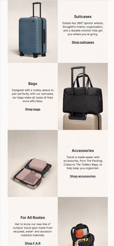 |
Campaign type: Product showcase.
Campaign goal: The primary goal is to increase product awareness and drive sales by highlighting the features and benefits of the Away travel collection.
Why is it effective?
In this email campaign, Away focused on the functionality and style of its products by presenting them in a way that resonates well with modern travelers looking for traveling solutions that are both efficient and fashionable.
The design enhances high-quality visuals and descriptive text that showcase the value and appeal of Away products. As the visuals and descriptions are well balanced, the campaign turned out to be informative and visually appealing, but not too heavy.
The distinctive feature of this email is its “Welcome to a world Away” headline, which cleverly plays with the brand name. The same goes for the CTA: “GET AWAY,” which is another smart play on words that ties the brand name to the action of traveling.
Altogether this campaign aims to showcase the comfort, style, and functionality of its products, with which a traveler will feel accordingly anywhere Away from home.
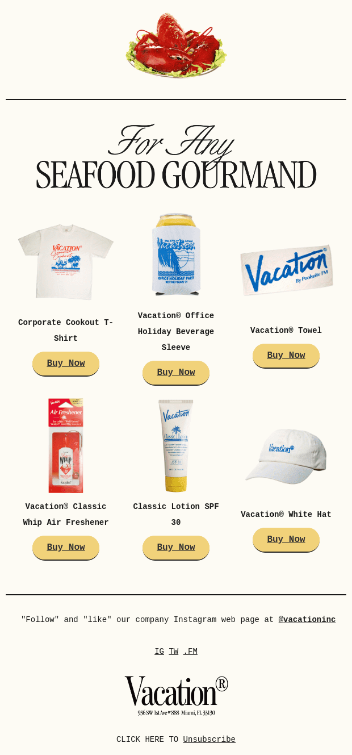
Vacation
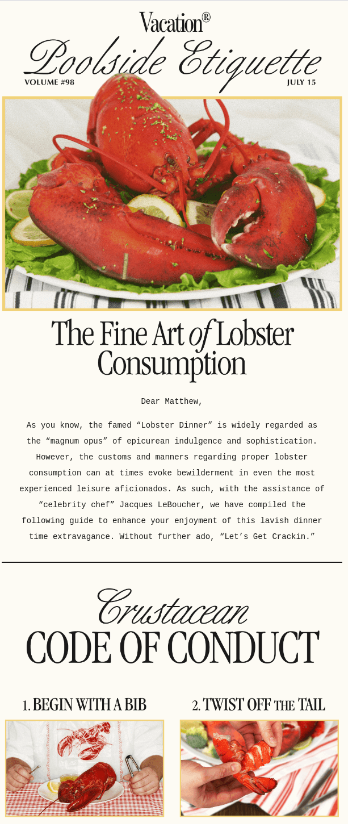 | 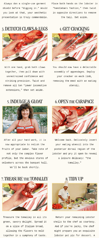 |  |
Campaign type: Themed newsletter.
Campaign goal: To engage the audience by providing a lighthearted and educational content piece and to cross-promote various branded merchandise linked to the theme of enjoying a vacation.
Why is it effective?
This is one of our favorite email marketing campaign examples, and we could not get past it! It just draws you in with its vibrant and juicy, rich red colors, making this newsletter from Vacation hard to resist opening. The newsletter is also stylized in a slightly retro-ish way, sending the reader back to times of luxury and elegance.
The detailed, step-by-step lobster eating guide not only entertains but also educates the reader, stimulating their engagement with the content. Additionally, the smart integration of product promotions at the end of the newsletter, which includes items like T-shirts, towel sleeves, and lotions, cleverly ties the dining experience back to the brand’s core products.
The overall playful tone and a fancy, tasty topic make this newsletter stand out in a crowded inbox.
Campaign bonus: It is personalized, which gives it another point on top of an outstanding design and engaging content.
Brother Moto
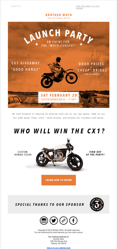
Campaign type: Event invitation.
Campaign goal: The primary goals are to increase awareness of Brother Moto’s new location and to drive attendance at the event.
Why is it effective?
This email campaign speaks to moto enthusiasts clearly and loudly. First, it is effectively designed with a visually striking vintage motorcycle theme that appeals directly to the target audience. By using a classic motorcycle image along with a sepia-toned background, Brother Moto managed to set a nostalgic and exciting tone for the event.
Second, the campaign clearly highlights the main attractions, such as giveaways, door prizes, affordable drinks, and good times—all the compelling reasons for the community to participate.
Finally, by outlining a new motorcycle contest at the event, this email marketing campaign spikes the anticipation even more.
Campaign bonus: Special thanks to the sponsor placed at the bottom, together with social media links, further solidify the community and partnership aspects of the event.
Venmo
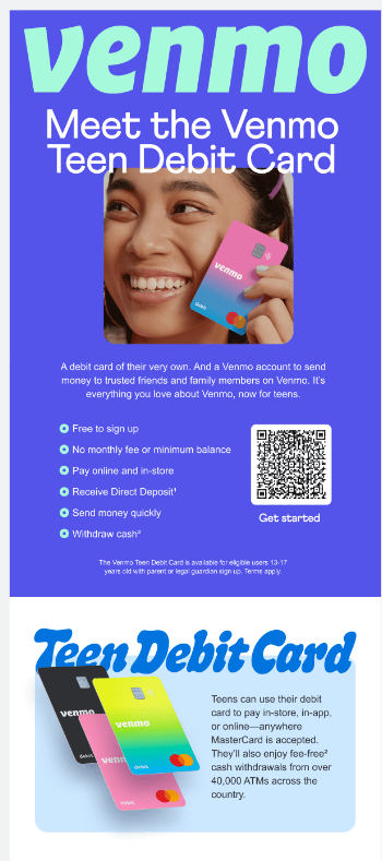 | 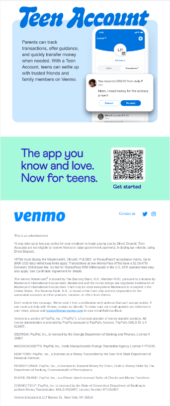 |
Campaign type: Niche product introduction.
Campaign goal: To introduce the new Venmo Teen Debit Card to potential young users and their parents.
Why is it effective?
This is one of the email marketing campaign examples that speaks the same language as its audience. The vibrant colors and bold fonts create a youthful and energetic feel, which is crucial for attracting a younger demographic.
Similarly, the inclusion of a prominent, easy-to-scan QR code directly in the email not only showcases Venmo’s technological advancement but also emphasizes the convenience of accessing their services. This is one more component of the campaign that perfectly aligns with the tech-savvy habits of today’s teenagers.
On the informative side, the email clearly lists the features and benefits of the Teen Debit Card, such as no fees, the ability to use the card both online and in-store, and the feature for parents to track transactions and transfer money, which assures parents about the control and safety of the account.
Udemy
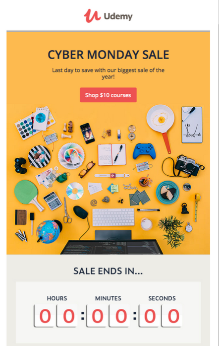 | 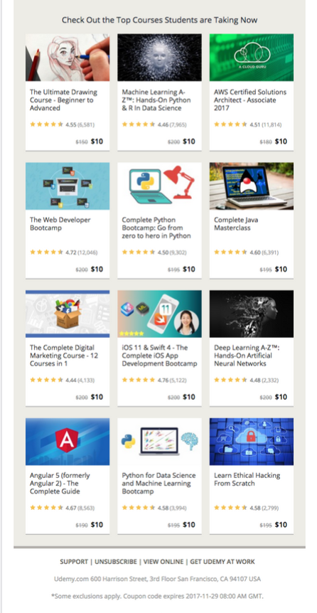 |
Campaign type: Special event sales campaign.
Campaign goal: To increase course enrollments by leveraging the urgency of Cyber Monday sales.
Why is it effective?
This campaign from Udemy is a good example of how a straightforward offer can be efficient. Thanks to its vibrant yellow color scheme, the campaign attracts attention to a wide choice of its courses, aiming at catching the interest of a diverse audience.
The bright yellow background not only catches the eye but also creates a positive atmosphere, which enhances the right mood for Cyber Monday sales.
While the “Shop $10 courses” CTA invites users to engage with an offer, the countdown timer adds a sense of urgency, nudging users to act quickly before the offer expires. This visual countdown is a strong motivator, reinforcing the limited-time nature of the sale.
While not personalized per se, the campaign targets a broader group of users with a presumed interest in affordability and self-improvement through learning.
To Sum Up
In this article, we tried to cover a wide range of different email campaigns by using email campaign examples from different companies and industries. Despite the diversity of occasions and email campaign ideas, some trends are universal, and elements are non-negotiable for each campaign.
Personalization, engaging CTA, and appealing design—these are some of each campaign’s must-haves. By skillfully applying these elements and mixing them into an inspiring, motivating, or funny copy, marketers lay the foundations for their campaign’s success, regardless of the occasion.