Settings for all email elements
Hide on desktop/mobile
You can hide any email element in the desktop version and show it only in the mobile version—or vice versa.
Background settings
Most email elements support custom backgrounds for a more personalized, visually appealing design. Simply toggle the background option on any element to enable its settings.
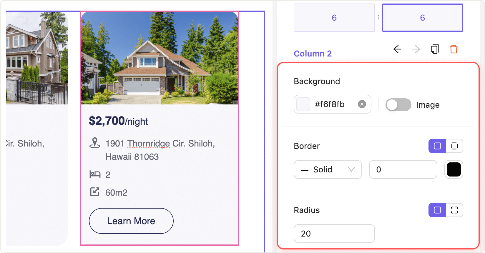
Available background settings
- Background color: Choose any color using the integrated color picker to match your brand or highlight specific sections. Reset the color by clicking X in the color picker.
- Border radius: Round all four corners at once for a softer look.
- Range: 0–1000 px
- Step: 1 px
- Border style: Select your border line type:
- Solid
- Dashed
- Dotted
- Border width: Set the thickness of the border on all sides.
- Range: 0–100 px
- Step: 1 px
- Border color: Choose the color using the color picker to make your element stand out or blend in.
Default background settings
When background settings are enabled, the following defaults are applied:
| Setting | Default value | |
|---|---|---|
| Background color | Transparent | |
| Border radius (all corners at once) | 0 | |
| Border style | Solid | |
| Border width | 0 | |
| Border color | Black |
Tip: Experiment with different combinations of background color, border style, and radius to make your emails more engaging and visually distinct. All settings are easily adjustable for maximum flexibility.
Still have questions?