Working with rows
Rows are the fundamental building blocks in the Email Builder. Each row provides a flexible container for organizing your content and offers a wide range of customization options to help you achieve the perfect layout for your email.
Core functionality
1. Row settings
To access row settings, click on the area outside the content zone (canvas area).
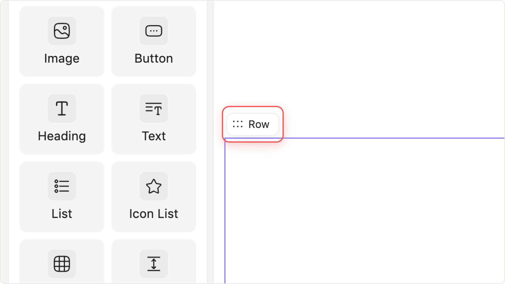
2. Adding & removing elements to/from rows
Drag and drop any basic email element into a row container. Once placed, you can adjust its settings and styles.
If you remove an element from a row, it returns to the general email settings panel.
3. Element settings inside rows
Click on an element inside a row (content area) to open its specific settings in the right sidebar.
4. Empty row hover
When you hover over an empty row, quick-add buttons for image, paragraph, and button elements appear.
Note: If the row is too small to fit these buttons, they will not be displayed.
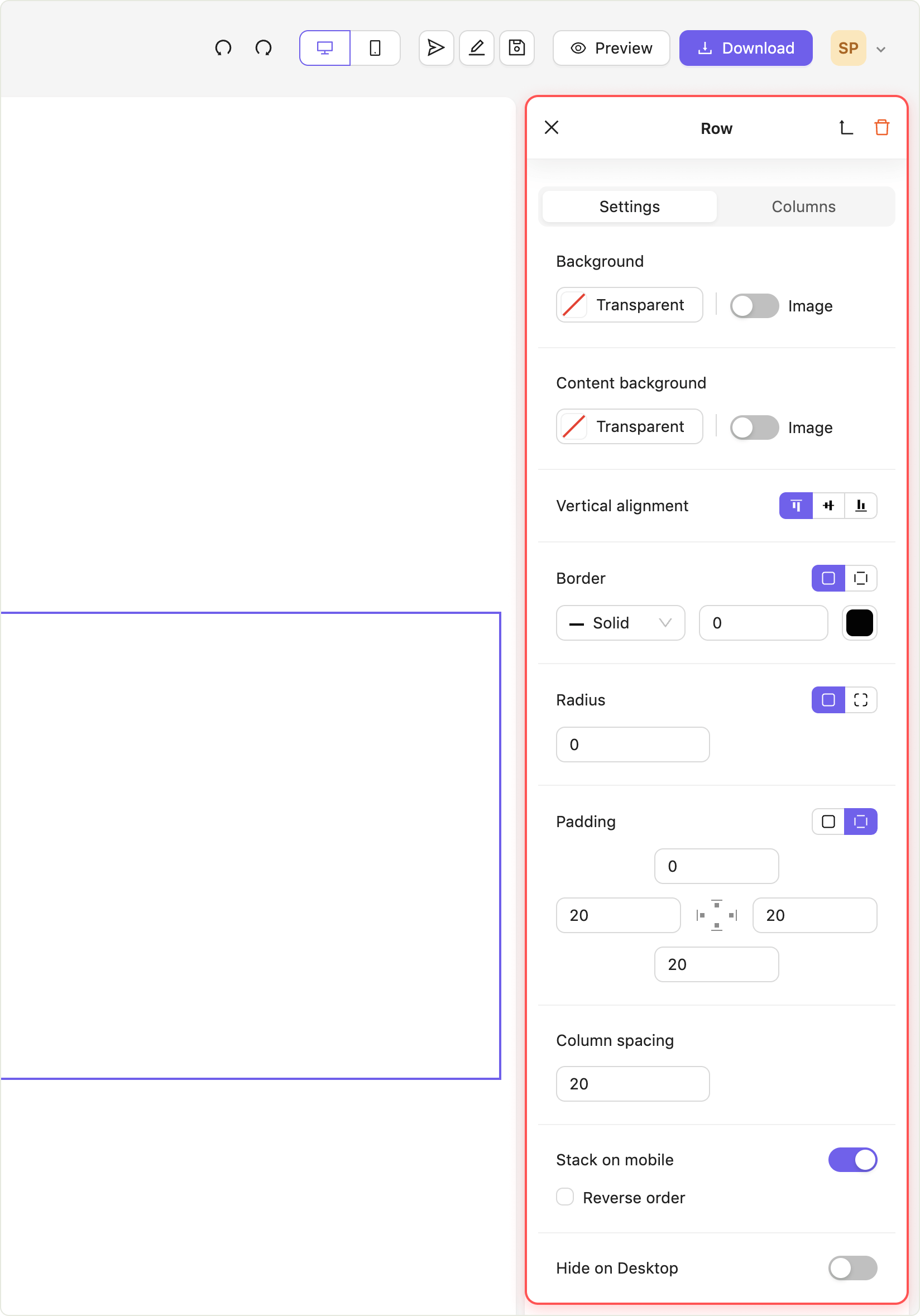
Row settings
The row settings are divided into two tabs, one for general configurations and one for individual column settings.
 Dimensions
- Height: Automatically adapts to the height of the content within the row.
- Width: Matches the overall width of the email.
Background area – the space between the borders of the row and the borders of the email canvas.
- Change the background color for the whole row using the color picker.
- Reset the color by clicking X in the color picker.
- Add or replace a background image using the image button or the arrow button.
- Remove the background image with the toggle switch.
- If no images are set in the rows, you will see the full or partial background image.
- If a row contains its own image, the background image may be partially or fully hidden behind it.
Content area – the space between the borders of a row and the borders of an element nested inside it.
- Change the background color for the row’s content area.
- Reset the color by clicking X in the color picker.
- Add or replace a content background image.
- Remove the image with the toggle switch.
Adjust the internal spacing (padding) between the element’s content and the edges of the row:
- Set left-right and top-bottom padding simultaneously.
- Set padding for each side individually.
- Align content within all columns to the top, middle, or bottom.
- Choose from three border styles: solid, dashed, or dotted.
- Adjust border thickness for all sides or individually.
- Select the border color using the color picker.
- Round the corners of the row’s content area.
- Apply rounding to all corners or each corner separately.
- Adjust the space between columns.
- Enable stacking all columns into one vertical line on mobile devices.
- Enabled by default.
- Reverse the order of columns so the right column appears above the left one on mobile devices.
- Only works with two columns and when Stack on mobile is enabled.
Column settings
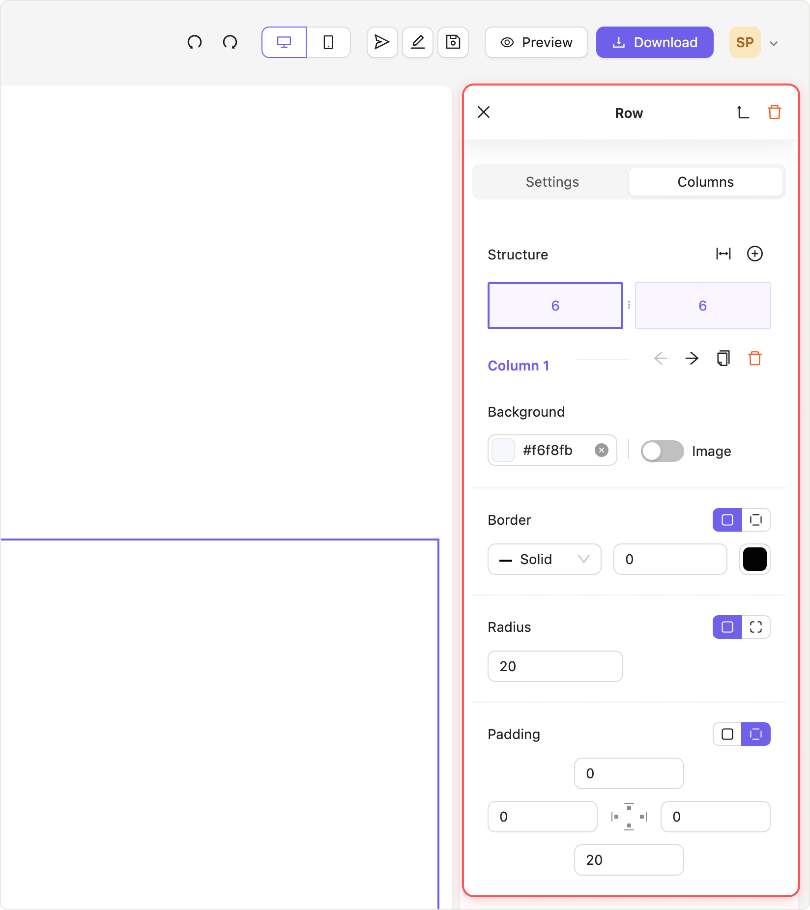 Structure
- Add column: Use the + button to add a column to a row.
- Delete column: Use the trash bin icon to remove a column.
- Duplicate column: Clone a column with all its settings.
- Reorder columns: Use arrows to move columns left or right.
- Change the background color using the color picker.
- Reset the color by clicking X in the color picker.
- Add or replace a background image.
- Remove the image with the toggle switch.
- Select from three border styles: solid, dashed, or dotted.
- Adjust border thickness for all or individual sides.
- Set the border color using the color picker.
- Round the corners of the column’s content area.
- Apply rounding to all corners or each corner separately.
- Adjust padding for the column.
- Set padding for all sides at once or for each side individually.